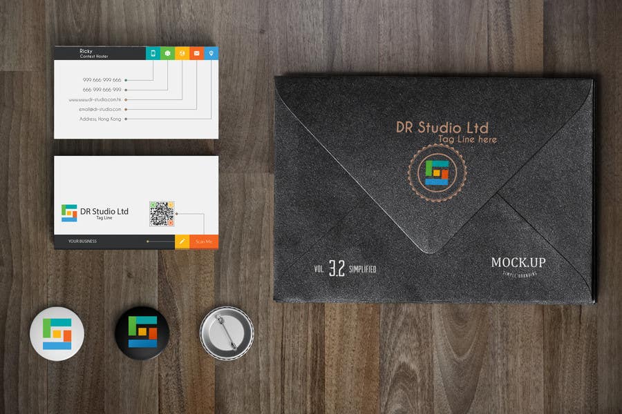
DR Studio Ltd. Corporate Identity
Hello Ricky, Please see all images. I found this contest just earlier 4 hour ago. So I have done many things if i missing something please reply. DS logo is made by color box. The logo is like illusion. With yellow box its looks like D and with yellow you can see its look D and S. I used the Page folders in dark color its look much better in dark and dark Black folders papers always attractive. As you can see i used many colors in A4 page that's because of flat color is in trend and it's always attractive. People may didn't remember about the subject or content in your page but the design of page will make them to remember you and your company. Tables are in color but if you need in simple then make them correct and bullets are also in color because of page theme. Top right corner is page number. Subject is more highlight now. Please see the Visiting card also. I don't know about your taste but i designed it very attractive. If you want this one is also in simple color then no problem.


