User Experience improvement for Website
- Status: Closed
- Præmier: $578
- Modtagne indlæg: 17
- Vinder: jerez88

Konkurrence Instruktioner
First of all: If you have questions or want to get my opinion on something, just chat with me. I´m ready to help you to understand what I need. Also via Skype.
I have a website that does not "feel right".
The basic requirement is an improvement in User Experience.
So for this contest I will post only one page that should be improved to keep the workload acceptable for a contest.
The winner should work on some of the smaller other pages as well for the winning budget.
Smaller pages: Accounts, Projects, Categories, Tags (Maybe they don´t even require changes?)
If there is more work required, we will negotiate further terms.
###########################################
The Website is a private finance software.
Users can record private expenses and income and analyze the financial data.
You can have a look at the website at:
http://web.cashbox.cash
Username: superfly-event@gmx.de
Password: superfly
(The site is still in development by the way...)
###########################################
So the site I want to improve now is the "Transactions" page.
Here the user can have a look through his transactions.
Also he can add new transactions.
A)
''''''''''''''''''''''''''''''''''''''''''''''''''''''''''''''''''''''''
Filters:
To search through his transactions there are filter controls, where the user can filter the transaction list if he is searching for something.
The filter controls occupy too much space on the website.
This is why we implemented the feature to hide and show the filters only when needed.
The filters look somehow unorganized and are not so easy for new users to understand.
-> Find a better way to present the filters and make them intuitive for the user.
B)
''''''''''''''''''''''''''''''''''''''''''''''''''''''''''''''''''''''''
Add Transaction window:
The add transaction window opens as a modal page above the normal website.
The modal has all the features that a user can enter for a new transaction.
But not all settings will be changed by the user most of the time, so maybe there is a better way to present the "Add Transaction" window.
Especially on the phone screen the content of the "Add Transaction" window is so big that it doesn´t fit on the phone screen completely.
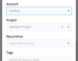
When adding a new transaction, the user can choose a category for his transaction like "Food" or "Travel" for example.
The category selection is at the moment a simple dropdown list with all the category names inside. This is very confusing because the user always has to scroll through many category names, to find the right one.
-> Find a better way to present the "Add Transaction" window. The often used options should be directly accessable, and it should fit on the phone screen completely without scrolling.
-> Improve how finding of categories from the "Add transaction" window is organized. It should be intuitive, beautiful and easy to understand.
C)
''''''''''''''''''''''''''''''''''''''''''''''''''''''''''''''''''''''''
-> Is the "Add Transaction" button visible enough?
D)
''''''''''''''''''''''''''''''''''''''''''''''''''''''''''''''''''''''''
-> I think the "Group delete" button, to delete more than one transaction at a time is a little far away from the transaction list.
E)
''''''''''''''''''''''''''''''''''''''''''''''''''''''''''''''''''''''''
And generally, also changes to the transaction list design, colors or other details are welcome if they improve the look and feel.
But in general I think the design is not bad, we just need to get the last polish on it, and need to improve the intuitive grasp.
F)
''''''''''''''''''''''''''''''''''''''''''''''''''''''''''''''''''''''''
The site is responsive, so it should work on phone browsers, tablet browsers and desktop computer browsers.
Because the mobile phone view is really important, the design should both match the requirements of small phone browser as well as large desktop browsers. Where neccessary you can
Anbefalede færdigheder
Offentlig Præciserings Opslagstavle

Sådan kommer du i gang med konkurrencer
-

Opret din konkurrence Hurtigt og nemt
-

Få tonsvis af indlæg Fra hele verden
-

Tildel det bedste indlæg Download filerne - Nemt!