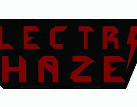
Rock Band Logo Design
- Status: Closed
- Præmier: $108
- Modtagne indlæg: 235
- Vinder: myllo

Konkurrence Instruktioner
Welcome to my first Design Contest!
An upcoming Rock Band needs a Logo. The bands name is Electric Haze. The music is like the classic rock and hard rock bands from the 70s and 80s with a progressive touch. Its not any kind of metal.
I want a clever design with Custom made letters with a sense of symmetry when looking at the result.
Think of the classic Rock Bands from the seventies and eighties.
I'm looking forward to a creative and unique design of yours!
Have fun and I look very much forward to receive your design!
Anbefalede færdigheder
Arbejdsgiverfeedback
“@myllo won the contest on 13 September 2013”
![]() SM6SIF, Sweden.
SM6SIF, Sweden.
Offentlig Præciserings Opslagstavle
-

Outafaze
- 10 år siden
Please show the winner! I want to see what it is you wanted!
- 10 år siden
Vis 2 beskeder mere
-

ivmolina
- 10 år siden
Well, i suggest you keep working with the winner till you get what you want or need. At this point is the best thing you can do. Probably some people has done "rock logos" before, i have done... not with the specifications or style you need. You have already choose a winner.
- 10 år siden
-

w4gn3r
- 10 år siden
I believe that choosing a winner you can make revisions on logo to reach your goal.
- 10 år siden
-
thomasstalder
- 10 år siden
HI
I'M POSTING MY LAST OPTIONS BUT I CAN'T SEE THEM. PLEASE MAKE SHURE THAT THEY ARE THERE- 10 år siden
-

Konkurrenceafholder - 10 år siden
The contest are not finnished. You can still do improvements. Everyone are welcome with new contributions!
four hours left.
Good luck!- 10 år siden
-
Konkurrenceafholder - 10 år siden
http://www.freelancer.com/contest/poll-MzMxNTU6MQ==
- 10 år siden
-

leiyo2
- 10 år siden
will you be basing your decision on who's going to win this contest by the votes the entries will get? Because I tried voting twice and it also counted my votes twice.
Good luck to the finalists!- 10 år siden
-
Konkurrenceafholder - 10 år siden
No i will take the decision by my self. I have got several improvements from both old participants and new ones. I agree to comments that the logos are not finnished. I have got issues on all the logos in the poll. Thanks!
- 10 år siden
-
PrithvirajsinghC
- 10 år siden
Please check #274 ...... thanks
- 10 år siden
-

STARWINNER
- 10 år siden
All the best to the finalists...Congrats
- 10 år siden
-

smarttaste
- 10 år siden
___________________________________________ #270 ___________
- 10 år siden
-

rinorakurhasku
- 10 år siden
Please rate!
- 10 år siden
-

BrainStormydea
- 10 år siden
Hi...please check my design #263 and #264 thank you :)
- 10 år siden
-
Konkurrenceafholder - 10 år siden
It is less than 24 hours left of the contest. It will not be extended. I have got a couple of logos that are allmost what i want. There are still a chance to send in a perfect and a winning logo. There is no clear winner at this time.
- 10 år siden
-
Konkurrenceafholder - 10 år siden
If you need inspiration you can check this for a creative, angular, symmetric but not containing backward letters..
https://www.google.se/search?q=helloween+logo&client=firefox-a&hs=sYa&rls=org.mozilla:sv-SE:official&source=lnms&tbm=isch&sa=X&ei=gvIZUv-TI6jj4QTLsIGADg&ved=0CAkQ_AUoAQ&biw=1600&bih=629#facrc=_&imgdii=_&imgrc=RvqZxqhVtybBTM%3A%3B0CKxsp1vQee8GM%3Bhttps%253A%252F%252Ffbcdn-sphotos-c-a.akamaihd.net%252Fhphotos-ak-ash4%252Fp480x480%252F485465_10151610221879173_407518544_n.jpg%3Bhttps%253A%252F%252Fwww.facebook.com%252Fhomiciderocker%3B426%3B166
Maby this logo can give you inspiration? http://www.airbournerock.com/sites/airbournerock.wmg-gardens.com/files/styles/home_carousel/public/201304/airbournecarousel.jpg?itok=PaTG73PV
Is it possible to put the letters inside a outline like this to get nice first and last letter? http://www.revolvermag.com/wp-content/uploads/2012/09/Metallica-logo1.jpg- 10 år siden
-
Outafaze
- 10 år siden
I am posting a couple different outlined ideas. The colors can be changed easily. Still not sure if this is what you're after. Please let me know if I'm on the right track.
- 10 år siden
-
Konkurrenceafholder - 10 år siden
Time is running fast.
If you need inspiration you can check this for a creative, angular, symmetric but not containing backward letters..
https://www.google.se/search?q=helloween+logo&client=firefox-a&hs=sYa&rls=org.mozilla:sv-SE:official&source=lnms&tbm=isch&sa=X&ei=gvIZUv-TI6jj4QTLsIGADg&ved=0CAkQ_AUoAQ&biw=1600&bih=629#facrc=_&imgdii=_&imgrc=RvqZxqhVtybBTM%3A%3B0CKxsp1vQee8GM%3Bhttps%253A%252F%252Ffbcdn-sphotos-c-a.akamaihd.net%252Fhphotos-ak-ash4%252Fp480x480%252F485465_10151610221879173_407518544_n.jpg%3Bhttps%253A%252F%252Fwww.facebook.com%252Fhomiciderocker%3B426%3B166
Maby this logo can give you inspiration? http://www.airbournerock.com/sites/airbournerock.wmg-gardens.com/files/styles/home_carousel/public/201304/airbournecarousel.jpg?itok=PaTG73PV
Is it possible to put the letters inside a outline like this to get nice first and last letter? http://www.revolvermag.com/wp-content/uploads/2012/09/Metallica-logo1.jpg- 10 år siden
-
ivmolina
- 10 år siden
Hi, i have submit some new proposal, i would like yo know your feedback. Best regards. Iv
- 10 år siden
-
ivmolina
- 10 år siden
Hi Sir, please check my entries, i will keep working some proposal, buy i would like to know your feed back about the last ones. #178 #179 #181 #182 #184 #185 #186
- 10 år siden
-
w4gn3r
- 10 år siden
Hi check my entry's please and feedback.
#198 - #199 - #200 - #201
If you want to change something, please send me request. Thanks- 10 år siden
-

zboyd
- 10 år siden
maybe it is more suggestive if you unseal the contest so that ppl could know what's your prefs.
- 10 år siden
-

arturkh
- 10 år siden
NO
- 10 år siden
-

lanangali
- 10 år siden
please check #161 .,,,,
- 10 år siden
-

sirrom
- 10 år siden
please check #152 . thanks - sirrom
- 10 år siden
-
Konkurrenceafholder - 10 år siden
Less than 24 hour left! Please make the creative, symmetric and pleasant logo I need it so bad!
- 10 år siden
-

SeelaHareesh
- 10 år siden
Check #130
- 10 år siden
-
Konkurrenceafholder - 10 år siden
2 days left and still no clear winner! Hope to see more from you guys!
- 10 år siden
-
sirrom
- 10 år siden
please check #106 . thanks - sirrom
- 10 år siden
-
Konkurrenceafholder - 10 år siden
Now it is not so much time left in the contest. Most of the suggestions I have received are pretty far away from what I want. I'm not so fond of curvy or broken letters. I prefer creative and angular. I have a couple of three-star proposals that have potential. The sketches that existed before the race still feels better than the one received.
The field feels pretty open so if you have any more suggestions please do not hesitate to submit it. If you have any questions, please let me know. Do not forget to read the description I wrote when I added the contest.
Have fun and good luck!- 10 år siden
-

sa37
- 10 år siden
plz check #96 .thnks
- 10 år siden
-
SeelaHareesh
- 10 år siden
Check #89
- 10 år siden
-
sirrom
- 10 år siden
please check #75 . thanks - sirrom
- 10 år siden
-

Woyislaw
- 10 år siden
#73 , pelase rate it or coment it. If you like it but want changes, please let me know. Thanks.
- 10 år siden
-
SeelaHareesh
- 10 år siden
Check #71 & #72 ...
Please give feedback...- 10 år siden
-
sirrom
- 10 år siden
please check #70 . thanks - sirrom
- 10 år siden
-
sirrom
- 10 år siden
please check #66 . thanks - sirrom
- 10 år siden
-
sirrom
- 10 år siden
please check #58 . thanks - sirrom
- 10 år siden
-

selcukakkaya
- 10 år siden
feedback #6 #7 #8 #9 pls
- 10 år siden
-
Konkurrenceafholder - 10 år siden
Thanks for the ideas! Check the old Red/white/black logos with Iron Maiden and Led Zeppelin etc. http://fondos-escritorio.com/user-content/uploads/wall/o/56/Fondo_Led_Zeppelin.jpg
Like if the letters have a more integrated feeling together with each other. I want them to smell mor Rock. Good luck. Thanks!- 10 år siden
Sådan kommer du i gang med konkurrencer
-

Opret din konkurrence Hurtigt og nemt
-

Få tonsvis af indlæg Fra hele verden
-

Tildel det bedste indlæg Download filerne - Nemt!