Redesign my Logo

  • Status: Closed
  • Præmier: $50
  • Modtagne indlæg: 31
  • Vinder: Saidurbinbasher

Konkurrence Instruktioner

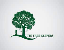
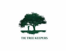
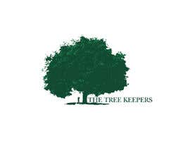
Attached are the current concept logo designs.

I am wanting to improve on this design.

The text of the logo needs to stay the same. Although the tree and arborist design is open for alterations or similar new designs.

Tips:
- I am hoping the image can portray an arborist standing in protection of the tree.

- I also want to portray that the tree is very large and mature(old). So the scale between the arborist and the tree, and also the tree design, will play an important factor.

Anbefalede færdigheder

Arbejdsgiverfeedback

“I am very happy with the entry which Saidur submitted which lead to his success in the contest. After the contest. The vector files were not cut or filtered correctly as the edges of the background were visible. When asked to correct these the response given was to please submit a good review.”

Profilbillede peteroh88, Australia.

Bedste indlæg fra denne konkurrence

Se flere indlæg

Offentlig Præciserings Opslagstavle

  • peteroh88
    Konkurrenceafholder
    • 5 år siden

    Thank you to all contestants and I appreciate the amount of entries submitted.

    • 5 år siden
  • peteroh88
    Konkurrenceafholder
    • 5 år siden

    I will be busy this evening when the contest is due to finish so the winner will be selected a couple of hours after the contest.

    • 5 år siden
  • peteroh88
    Konkurrenceafholder
    • 5 år siden

    I have just attached a zip file with the font required.

    Please use this font.

    (NOTE : DO NOT USE CAPITOL LETTERS)

    • 5 år siden
  • peteroh88
    Konkurrenceafholder
    • 5 år siden

    Thank you for all of the entries so far.

    • 5 år siden
  • peteroh88
    Konkurrenceafholder
    • 5 år siden

    Please dont take the rejection in the wrong way. I am just making it easier to manage.

    • 5 år siden
  • peteroh88
    Konkurrenceafholder
    • 5 år siden

    Entry number 55 and 57. Both these tree designs are good. But the text is again incorrect. Please refer to my attached files. Thanks

    Entry number 35. This design with the roots underneath the tree is great. Although the tree design I would prefer 55 and 57. And the text is correct for this entry. Well done!

    • 5 år siden
  • peteroh88
    Konkurrenceafholder
    • 5 år siden

    Thank you for the entries. Just a common one with the good is that the text ' The Tree Keepers' needs to stay the same. Including the H and E of ' THE '.

    • 5 år siden
  • peteroh88
    Konkurrenceafholder
    • 5 år siden

    Please keep in mind that I want the text of the logo to stay the same.

    • 5 år siden

Vis flere kommentarer

Sådan kommer du i gang med konkurrencer

  • Opret din konkurrence

    Opret din konkurrence Hurtigt og nemt

  • Få tonsvis af indlæg

    Få tonsvis af indlæg Fra hele verden

  • Tildel det bedste indlæg

    Tildel det bedste indlæg Download filerne - Nemt!

Opret en Konkurrence Nu eller slut dig til os i dag!