Logo for new business - Jessanda Farm Fresh

  • Status: Closed
  • Præmier: $50
  • Modtagne indlæg: 139
  • Vinder: dariuszek2016

Konkurrence Instruktioner

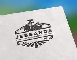
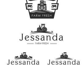
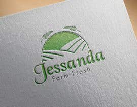
Update...there have been some phenomenal designs thank you. After looking over many designs we are tending to like the rolling hills and farm feel that is a representation of our country life. Some of the tree designs are brilliant as we had suggested in our original description and it is making a decision very difficult for us. Loving the green colours and simplicity of designs. We would ask one last favour is to include a couple of images that include a tractor, cow and a chicken as part of the logo as more of a silhouette shape in the background without making the logo too busy to really capture the core parts of our business. We thank you again for all the time and effort in helping us find our perfect logo.

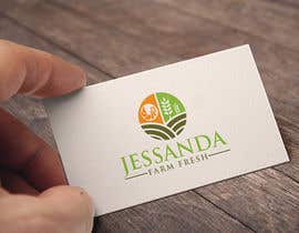
We have fresh produce to sell direct from a farm. Our market for this produce is local cafes, restaurants and wholesale markets in major cities. We are look for a simple but classy design that captures our company name and fresh produce. We are not looking for a corporate style logo. We have uploaded some basic ideas but we are very open to any idea that someone with an artistic mind can make work for us. We like the simplicity of black and white but also like the ideas of tractors. We also like colours that would highlight the "fresh" produce angle.

Anbefalede færdigheder

Arbejdsgiverfeedback

“Darek came up with some amazing designs for our business and was very accommodating in making small changes to ensure it was exactly what we wanted. Would definitely hire again.”

Profilbillede Jessanda, Australia.

Bedste indlæg fra denne konkurrence

Se flere indlæg

Offentlig Præciserings Opslagstavle

  • SMTarikuzzaman
    SMTarikuzzaman
    • 4 Ã¥r siden

    Sir please knock me///

    • 4 Ã¥r siden
    1. Jessanda
      Konkurrenceafholder
      • 4 Ã¥r siden

      Hi Tarikuzzaman. I don't know what you mean by knock me. I appreciate the offer but we have almost made our decision. Just prefer to be honest with you and hope you understand.

      • 4 Ã¥r siden
  • Mu32865
    Mu32865
    • 4 Ã¥r siden

    Please Check #79

    • 4 Ã¥r siden
    1. Jessanda
      Konkurrenceafholder
      • 4 Ã¥r siden

      Hi Muhammad. Thank you for the design. The tractor is a bit too large for the overall image for us and just a little overpowering.

      • 4 Ã¥r siden
  • fatemamohsin
    fatemamohsin
    • 4 Ã¥r siden

    please check #126

    • 4 Ã¥r siden
    1. Jessanda
      Konkurrenceafholder
      • 4 Ã¥r siden

      Thanks Fatema for the design and incorporating our farm life. Logo probably just a little too colourful for what we are looking for

      • 4 Ã¥r siden
  • faouzibouyattar
    faouzibouyattar
    • 4 Ã¥r siden

    hello bro ... Please Check my entry #137

    • 4 Ã¥r siden
    1. Jessanda
      Konkurrenceafholder
      • 4 Ã¥r siden

      Hi Faouzi. I really like the lines drawing you to the tractor image. Not sure about the khaki colour as a little dark but like your concept. Our farm is mostly cows and chickens for egg production.

      • 4 Ã¥r siden
  • hklogodesign
    hklogodesign
    • 4 Ã¥r siden

    Please Check my entry #130

    • 4 Ã¥r siden
    1. Jessanda
      Konkurrenceafholder
      • 4 Ã¥r siden

      Hi Humayun. Thank you for the design. Probably a little too cluttered or cramped in its current format

      • 4 Ã¥r siden
  • adi2381
    adi2381
    • 4 Ã¥r siden

    please check #131 and #132 (updated based on the feedback given in #72 )

    • 4 Ã¥r siden
    1. Jessanda
      Konkurrenceafholder
      • 4 Ã¥r siden

      Hi Aditya. Have left a comment on the image for you. Thank you

      • 4 Ã¥r siden
  • fatemamohsin
    fatemamohsin
    • 4 Ã¥r siden

    please check #64

    • 4 Ã¥r siden
    1. Jessanda
      Konkurrenceafholder
      • 4 Ã¥r siden

      Hi Fatema. I like the way you have used the wheat as tyre tracks. Very innovative

      • 4 Ã¥r siden
  • soniasony280318
    soniasony280318
    • 4 Ã¥r siden

    please view #16 , #17 , #19 for better experience

    • 4 Ã¥r siden
    1. Jessanda
      Konkurrenceafholder
      • 4 Ã¥r siden

      Thank you Salina for your designs. I do prefer the white background over the black as it fits more with the country feel

      • 4 Ã¥r siden
  • AnanievA
    AnanievA
    • 4 Ã¥r siden

    Hello, please check #26 #27 , I tried to take into account all your wishes and create a unique and stylish logo. The logo looks good on both light and dark backgrounds. There is an image in any format and vector sources (they may be needed in the future for making packaging, printing and advertising products). I hope you enjoy my work.

    • 4 Ã¥r siden
    1. Jessanda
      Konkurrenceafholder
      • 4 Ã¥r siden

      Hi Aleksey. I really like your designs. I am not an expert like you but just wondering about the balance. Love the tractor and the tree. Would it look weird if the words Jessanda Farm Fresh aligned to the left with the tree directly above if that makes sense

      • 4 Ã¥r siden
  • SMTarikuzzaman
    SMTarikuzzaman
    • 4 Ã¥r siden

    Please check #57 #58 #60 #62 .

    • 4 Ã¥r siden
    1. Jessanda
      Konkurrenceafholder
      • 4 Ã¥r siden

      Hi Tarikuzzaman. We very much appreciate your effort on providing us some designs. The designs seem to have more of a nautical theme and probably not our ideal brand. Thanks again.

      • 4 Ã¥r siden
  • adi2381
    adi2381
    • 4 Ã¥r siden

    check #72 for a truly non-corporate & clean logo
    Thank you :)

    • 4 Ã¥r siden
  • SMTarikuzzaman
    SMTarikuzzaman
    • 4 Ã¥r siden

    Sir please knock me

    • 4 Ã¥r siden

Vis flere kommentarer

SÃ¥dan kommer du i gang med konkurrencer

  • Opret din konkurrence

    Opret din konkurrence Hurtigt og nemt

  • FÃ¥ tonsvis af indlæg

    Få tonsvis af indlæg Fra hele verden

  • Tildel det bedste indlæg

    Tildel det bedste indlæg Download filerne - Nemt!

Opret en Konkurrence Nu eller slut dig til os i dag!