logo design for "visione.co"
- Status: Closed
- Præmier: $100
- Modtagne indlæg: 15
- Vinder: RobertoValenzi


Konkurrence Instruktioner
The "visione.co" is a web software designed within the concept of "effectiveness with simplicity." He is the first in a line of five software web launch, all on the same concept.The "visione.co" solves a complex problem withi
Anbefalede færdigheder
Arbejdsgiverfeedback
“Professional excellent technical quality (very creative) and human (very thoughtful and kind). The "Freelancer.com" is much better with you. Congratulations!”
![]() fabiodia, Brazil.
fabiodia, Brazil.
Offentlig Præciserings Opslagstavle
-

Iva1905
- 11 år siden
Please check #232
- 11 år siden
-

Hasanath
- 11 år siden
Please check #211 & #212.Thanks.
- 11 år siden
-

justwoomass
- 11 år siden
I had a great time creating your logos. Can you please provide feedback on #197 ? Thank you for your time!
- 11 år siden
-
Predan
- 11 år siden
Hello CH check #188 and #185 tnx for your time
- 11 år siden
-

AbdurrahmanOs
- 11 år siden
Please check #186 and acquire me your valuable feedback. Thanks :)
- 11 år siden
-

kaken01
- 11 år siden
#185 may not be what you are looing for but it was fun to create. Please give feedback.
- 11 år siden
-

PPG9773
- 11 år siden
Some lovely looking logos in this comp...
- 11 år siden
-
kaken01
- 11 år siden
Please give attention to #160 and #161
- 11 år siden
-

LAgraphicdesign
- 11 år siden
Hello Sir. Please check #156. Thank you
- 11 år siden
-

bestidea1
- 11 år siden
please check #151 .
- 11 år siden
-

shambhaviholay
- 11 år siden
PLEASE CHK 150
- 11 år siden
-
shambhaviholay
- 11 år siden
Looking for feedback #148.Regards.
- 11 år siden
-
focuzarts
- 11 år siden
Looking for feedback #145.Regards.
- 11 år siden
-

winarto2012
- 11 år siden
feedback please #93 #138
- 11 år siden
-

kishanlalyadav
- 11 år siden
Dear sir!! Greetings from kishan!! please see my design & Give me Your valuable feedback!! #125,#127!
Thanks!!!- 11 år siden
-

Konkurrenceafholder - 11 år siden
(125/127) Hi Thank you for your participation. You have good creativity. Reconsidered the design "125" because it shows a chart and it's a software issue. The logo has to be strong, sleek, smart and clean. You can not insinuate optical products. Please send new designs. Thank you.
- 11 år siden
-
AbdurrahmanOs
- 11 år siden
Please check #126, and leave a feedback. Thanks :)
- 11 år siden
-
Konkurrenceafholder - 11 år siden
(126) hello. Thank you for your dedication. Its design is reminiscent of optical products and this is a message that will not go with the brand. Please send new logo. Thank you.
- 11 år siden
-
kaken01
- 11 år siden
Please review #131
- 11 år siden
-
Konkurrenceafholder - 11 år siden
(131) Its design is clever, but the colors are impoverishing the brand. It conveys weakness. Please submit a new drawing. Thank you.
- 11 år siden
-
bestidea1
- 11 år siden
please rate #130 .
- 11 år siden
-
AbdurrahmanOs
- 11 år siden
Please check #126
- 11 år siden
-
kaken01
- 11 år siden
As you gander the projects, please visit post # 120. Thank you.
- 11 år siden
-

Dizzyjoe
- 11 år siden
check out #115 please
- 11 år siden
-
bestidea1
- 11 år siden
Please check #108 thank you .
- 11 år siden
-
Iva1905
- 11 år siden
Please check #94. Thank you.
- 11 år siden
-
Konkurrenceafholder - 11 år siden
Please check a private message.Thanks.
- 11 år siden
-
Konkurrenceafholder - 11 år siden
NOTICE TO ALL:
To view an attachment, please click on the "view brief" and access the file in powerpoint. Thanks.- 11 år siden
-
Dizzyjoe
- 11 år siden
here's a simple and new design.. #90
- 11 år siden
-

aliartdesign
- 11 år siden
sorry that was #82
- 11 år siden
-
aliartdesign
- 11 år siden
hi , please check my new #28 , thank you
- 11 år siden
-
Dizzyjoe
- 11 år siden
Thanks for your feedback..! have a look at #80 please.. thanks !
- 11 år siden
-
Konkurrenceafholder - 11 år siden
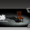
(80) Thanks for another drawing, Dizzyjoe. I see the "1" and "ONE" with the same message in the logo. Using both can "weigh" in the drawing. Another thing, the design is where the "1" (icon) reminds wheelchair.
- 11 år siden
-
Konkurrenceafholder - 11 år siden
MESSAGE TO ALL:
To help in the inspiration and creativity of the logo I have attached a file with more information about "visione.co." It may be that the screen provides some elements for you to work. I hope to help, not confuse. Thanks for the creative effort of all of you.- 11 år siden
-

bluedartdesigner
- 11 år siden
Please check #79
- 11 år siden
-

pixelhubdesigns
- 11 år siden
please check #64..thanks
- 11 år siden
-
Konkurrenceafholder - 11 år siden
Thanks for the new batch of drawings. The "NE" highlighted in the statement adds nothing. The "ONE" was lost with the emphasis on the "NE".
- 11 år siden
-
bestidea1
- 11 år siden
please check #68 thank you .
- 11 år siden
-
Dizzyjoe
- 11 år siden
hi, please have a look at #61 , thanks !
- 11 år siden
-
Konkurrenceafholder - 11 år siden
Thank you for submitting your design. You could find another important point of the product the "ON" (you are continuously connected) and still kept one. I can not see the icon and I think the colors could improve.
- 11 år siden
-

patrickpamittan
- 11 år siden
Hello sir please check #40
best regards!- 11 år siden
-
aliartdesign
- 11 år siden
hi , can you please check my #55 , thank you
- 11 år siden
-
Konkurrenceafholder - 11 år siden
His picture is intelligent, but the beauty was impaired by the shape of the icon. I liked that you dare to move the icon to another location name. Thank you for your dedication.
- 11 år siden
-

griffinstudios
- 11 år siden
PLease check #38 #39 #41..thanks
- 11 år siden
-
Konkurrenceafholder - 11 år siden
Thanks for the picture. I think the icon is hogging the name. The name has to be strong, smart and clean.
- 11 år siden
-

mega619
- 11 år siden
ch please take a peek on my other entry #36 thanks!
- 11 år siden
-
focuzarts
- 11 år siden
Please do post your feedback on #23,#24.Thanks and Regards.
- 11 år siden
-
Konkurrenceafholder - 11 år siden
I thought the design 23 creative, friendly and adventurous, but do not think he is a web software to businesses. He would fine other business segments. She was also charged with two icons. But I confess I liked you for daring.The picture 24 follows a general line as shown in other proposals. Are you good at creating original models, different. Please use this anymore. Thank you.
- 11 år siden
-
pixelhubdesigns
- 11 år siden
PLease check..#27..Thanks
- 11 år siden
-
Konkurrenceafholder - 11 år siden
Thanks for participating. This picture is a complex idea, confused. I think the number of elements used. It has to be a strong, clean and not so obvious.
- 11 år siden
Sådan kommer du i gang med konkurrencer
-

Opret din konkurrence Hurtigt og nemt
-

Få tonsvis af indlæg Fra hele verden
-

Tildel det bedste indlæg Download filerne - Nemt!