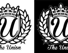
Logo Design for "The Union" motorsport group

  • Status: Closed
  • Præmier: $100
  • Modtagne indlæg: 57
  • Vinder: resistantdesign

Konkurrence Instruktioner

The union is an enthusiast automobile association. Members of the association meet weekly to share their passions. All cars of members features a logo of the association in their car windshield, which differentiates their highly modified vehicles with class.

For the logo, if possible, we would like to find out the new banner script in it but with something representing cars like a coilover (lowering suspension system) wheels, shift knobs, or anything else related to the tuning world. We want that people would be able to understand what TheUnion represent without knowing it with something special again. That logo will be use to create some clothes and accessories. So, keep in mind tha the banner that we want need to be something fresh, class and clean representing our car club with something representing the automotive tuning world (car parts, or something else you judge more appropriate)

A new team banner to put at the bottom of our car’s windshield to be represent as a team in car meets. For this banner we would like to have something clean and classy, not to much with the name of the team; TheUnion. Now we’re using the Edwardian Script on MS Word but we want something fresher and new.

You will find the old logo of the association, as well as logos of our closest competitors and friends.

Anbefalede færdigheder

Arbejdsgiverfeedback

“Resistantdesign did an excellent job on this work!”

Profilbillede anthonyparisien, Canada.

Offentlig Præciserings Opslagstavle

  • ibanezdustin1314
    ibanezdustin1314
    • 10 år siden

    Please see #61

    • 10 år siden
  • Chewpo
    Chewpo
    • 10 år siden

    Is there anything else you would like to see? I am eager to create the perfect design for you guys!!

    • 10 år siden
  • Chewpo
    Chewpo
    • 10 år siden

    With Edwardian Script please check #40

    • 10 år siden
  • Chewpo
    Chewpo
    • 10 år siden

    I have submitted the new entry! all the changes you aced for.

    • 10 år siden
    1. Chewpo
      Chewpo
      • 10 år siden

      #38

      • 10 år siden
  • anthonyparisien
    Konkurrenceafholder
    • 10 år siden

    Members of the crew did like what you did with the coat of arm. However, you must not forget (I admit that it wasn't really clear) that it is for a car sticker. So of course there can be details, but not that much, especially with the reflect effect you put. In addition, the logo can only be in black and white.

    We are getting closer Sephensmall!

    • 10 år siden
    1. stephensmall
      stephensmall
      • 10 år siden

      Oh I see. I added greys because you said in an earlier post "grey, black and white". I'll work on flattening the image now, simplifying it and taking out the grey; using only black and white.

      • 10 år siden
  • Chewpo
    Chewpo
    • 10 år siden

    also do you want the flags incorporated in the new design?

    • 10 år siden
    1. anthonyparisien
      Konkurrenceafholder
      • 10 år siden

      We want something class that looks professional as the logo of our competitors. By example, a racing flag aint tha much class or high-end. It looks more fisher price... Chewpo we would like to have both logo and banner. The design need to be really close.

      • 10 år siden
    2. Chewpo
      Chewpo
      • 10 år siden

      ok awesome!

      • 10 år siden
  • stephensmall
    stephensmall
    • 10 år siden

    No probs. I'm all over it

    • 10 år siden
  • anthonyparisien
    Konkurrenceafholder
    • 10 år siden

    Stephensmall I really like you logo. The gear shift selector is really well done, but you could probably add by example the gear number, showing that it is a gear selector (for dumb people). In addition, I do like the leaf but overall the logo looks a lot as the one of out competitors... Could you please use something else? A coat of arms by example? Think high end!

    • 10 år siden
  • anthonyparisien
    Konkurrenceafholder
    • 10 år siden

    We would prefer the use of colours as grey, black and white. It's in order to make the logo fit with all the colours of ours cars.

    • 10 år siden
  • ravipratap95
    ravipratap95
    • 10 år siden

    Ill Try Something ....

    • 10 år siden
    1. anthonyparisien
      Konkurrenceafholder
      • 10 år siden

      I'll wait for it thanks!

      • 10 år siden
  • Chewpo
    Chewpo
    • 10 år siden

    So you want a banner and a logo?

    • 10 år siden

Vis flere kommentarer

Sådan kommer du i gang med konkurrencer

  • Opret din konkurrence

    Opret din konkurrence Hurtigt og nemt

  • Få tonsvis af indlæg

    Få tonsvis af indlæg Fra hele verden

  • Tildel det bedste indlæg

    Tildel det bedste indlæg Download filerne - Nemt!

Opret en Konkurrence Nu eller slut dig til os i dag!