Design a Logo for Website
- Status: Closed
- Præmier: $140
- Modtagne indlæg: 27
- Vinder: niccroadniccroad

Konkurrence Instruktioner
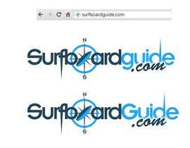
I need a new logo for my new website SurfboardGuide.com. I would like it to be in the form of a Compass with the North South needle being a surfboard. Attached is a very basic example of what I want, plus some sample images I have collected to inspire you!
A version with some 3d effects would be favored.
The logo can feature the words Surfboard Guide or SurfboardGuide.com to fit depending on how your design looks
Mainly blue preferred - but get creative!!
Anbefalede færdigheder
Arbejdsgiverfeedback
“Very responsive to feedback great design work”
![]() surfermark, Australia.
surfermark, Australia.
Offentlig Præciserings Opslagstavle
-

jeganr
- 10 år siden
plz check in full view and feedback 57,58,59
- 10 år siden
-

ramapea
- 10 år siden
#54 for you sir... :)
- 10 år siden
-
thetouch
- 10 år siden
Please check my entry# 50 & 53. I have tried to give the logos a much simpler and clear look so that it is easier to read and remember. Also I have added a pinch of 3D element to it, as you wanted it. Feel free to give your valueable suggestions to improve it further if needed. Regards
- 10 år siden
-

Kugel
- 10 år siden
Hey! Please check my desings, #42 #44 #45 #46
If you have any questions or want any colour variations please contact me.
Thank you.- 10 år siden
-

karlcloy123
- 10 år siden
Hi CH please check #30 simple and clean design.
- 10 år siden
-

niccroadniccroad
- 10 år siden
there you go, #27
- 10 år siden
-
niccroadniccroad
- 10 år siden
Hi,
Thanks for the feedback. How's #18 looking?- 10 år siden
Vis 1 besked mere
-
niccroadniccroad
- 10 år siden
Hi,
Thanks very much for your feedback. I'll work on those changes now for you.
Cheers,
Nic- 10 år siden
-
Konkurrenceafholder - 10 år siden
26 is looking really good. I prefer the bottom one that doesnt have the star sticking out too high. Maybe get rid of the splash on the e at the end as I dont think we really need that. Getting real close!!
- 10 år siden
-
niccroadniccroad
- 10 år siden
Hi,
#26 , with the changes you wanted. The bottom one I made the compass star slightly smaller too.- 10 år siden
-

ygugutkov
- 10 år siden
#13 feedback
- 10 år siden
-
Konkurrenceafholder - 10 år siden
I like the simplicity of the compass star but not sure about the font. The wave is taking up too much presence as well but like the idea of trying a wave in the logo
- 10 år siden
-
Konkurrenceafholder - 10 år siden
Maybe throw that version of the star as the O in Surfboard and se how it looks.... ?
- 10 år siden
-
niccroadniccroad
- 10 år siden
#8....wet look
- 10 år siden
-
Konkurrenceafholder - 10 år siden
Your number 11 version is the best so far as it's getting simpler. But we are not quite there yet sorry. Your other re just a bit too much detail to read easily
- 10 år siden
-
Konkurrenceafholder - 10 år siden
Maybe someone should try using the O in surfboard as the compass so that the name stands out
- 10 år siden
-
Konkurrenceafholder - 10 år siden
So far all the fonts are too small to read At the size they appear on screen the writing should be clear
Thanks- 10 år siden
-

bramde
- 10 år siden
looks nice @niccroadniccroad :)
- 10 år siden
-
niccroadniccroad
- 10 år siden
cheers!
- 10 år siden
-
niccroadniccroad
- 10 år siden
and #4, bit of retro look...
- 10 år siden
-
niccroadniccroad
- 10 år siden
and #2...mainly blue
- 10 år siden
-
niccroadniccroad
- 10 år siden
Hey...looks like I'm first, so how's #1?
- 10 år siden
Sådan kommer du i gang med konkurrencer
-

Opret din konkurrence Hurtigt og nemt
-

Få tonsvis af indlæg Fra hele verden
-

Tildel det bedste indlæg Download filerne - Nemt!