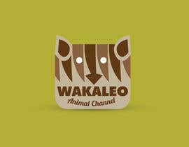
Design a logo for the Wakaleo animal channel!
- Status: Closed
- Præmier: $120
- Modtagne indlæg: 26
- Vinder: wavyline

Konkurrence Instruktioner
I operate an online content business that centres on filming animals/wildlife. I need a logo.
The logo should incorporate an animal that you have never heard of. It's called a wakeleo. This is an ancient Australian mammal. There is very little visual references to this creature but I will try and help you out.
First of all, here is a link to some info and an artist's interpretation of a wakaleo: http://carnivoraforum.com/topic/9331056/1/
You're not likely to find another reference to this animal however it has a relative that is more popular called Thlylacoleo Carnifex.
You can see interpretations of this animal here https://www.google.com.au/webhp?tab=ww&ei=MPjLUujAN4eekQX9h4G4CQ&ved=0CBUQ1S4#q=thylacoleo%20carnifex
Although I'd prefer it to look more like a wakaleo than a thylacoleo I understand this is an ancient species so I don't mind if you take some artistic license on the look of the animal. I understand this is a carnivorous species but that doesn't mean you have to design it to be snarling or aggressive.
The website this logo will be used for will feature many different species and for the most part will have a positive vibe. In short, it's a celebration of animals, large and small.
Text wise I am looking for 'Wakaleo' or 'Wakaleo animal channel'. Probably leaning towards just the one word at this stage but I'm not certain.
Also open to logos with no text.
I have not pictured in my head what this logo is to look like but if you can show me something I'm sure I will quickly identify what takes my eye.
On a side note, this is a seriously cool animal I hope you enjoy the challenge.
I'll try and give as much feedback to anyone who asks.
Winner will have need to sign a copyright release form for their design.
All the best!
Adam Cox
Anbefalede færdigheder
Arbejdsgiverfeedback
“Wavyline delivered faster than I could have hoped. He puts thought into his projects and it shows in the results. Fast, creative and responds very well to direction with exemplary communication skills.”
![]() AdamCox17, Australia.
AdamCox17, Australia.
Offentlig Præciserings Opslagstavle
-

Konkurrenceafholder - 10 år siden
Some amazing entries into this one. There were other designs just as worthy of winning but the chosen design was the most suited to the project. Thank you everyone!
- 10 år siden
-

Kuczakowsky
- 10 år siden
Hi There, please check #129 and #130 , Thank you.
- 10 år siden
-

KonstantinaD
- 10 år siden
Beautiful logo! Seeing this i want to make papercut animals! :)
- 10 år siden
-

angelajohnson70
- 10 år siden
#'s 122-125, just added. I thought including a negative splice would tie in well. I think this would look nice on a tshirt as well, didnt have the time to show that.
Let me know what you think!
Thanks- 10 år siden
-

anistuhin
- 10 år siden
Please, check #116, #117, #118.
- 10 år siden
-
angelajohnson70
- 10 år siden
Please let me know what you think of #'s 101 and 102. I set these up to look more like a cable channel logo and I think this is the direction that you wanted this, also spent time recreating the animal from the image you provided. We can alter anything you see here.
Thanks
Angela- 10 år siden
-
Konkurrenceafholder - 10 år siden
Good job on those as well. I personally think they would be better suited to a children's book than a logo for broadcast. I'm looking at imagery that is easily identifiable so probably not so busy.
- 10 år siden
-
angelajohnson70
- 10 år siden
ok revisions on that with #112 and #113.
Thanks- 10 år siden
-
angelajohnson70
- 10 år siden
Also let me know on #'s103 and 104.
Thanks!- 10 år siden
-
Konkurrenceafholder - 10 år siden
They look good. They're too close to the original character though I'd be done for copyright.
- 10 år siden
-

dragonarm
- 10 år siden
I know you're fine with a cartoon or a serious/aggressive logo but what do you lean more towards?
- 10 år siden
-
Konkurrenceafholder - 10 år siden
I'm after simplicity but stylish. I'm leaning towards a demographic that's about 60% female, 40% male with an average age of 25 - 55. Probably leaning towards a more professional looking logo. One that you might see a zoo use.
- 10 år siden
-

graficity
- 10 år siden
Hi sir. Please check #87 i made some visual retouch.
- 10 år siden
-
Konkurrenceafholder - 10 år siden
Your design is right up there in the top 3.
- 10 år siden
-

mestyl
- 10 år siden
Have 93-96 been evaluated?
- 10 år siden
-
Konkurrenceafholder - 10 år siden
Some of these entries are looking great. I wouldn't mind seeing one that had a look similar art style to this as well:
http://www.listal.com/topic/ty-the-tasmanian-tiger- 10 år siden
-
angelajohnson70
- 10 år siden
I think I would do something like that but have him with an outfit similar to an explorers outfit. Would take a couple of hours though.
- 10 år siden
-

Dreyo
- 10 år siden
Please check #54 Thankew.
- 10 år siden
-

chenjingfu
- 10 år siden
Working on it,waiting for my entry please.
- 10 år siden
-

jaspal555
- 10 år siden
Hi, Please provide feedback on #32 and #33.
Thank you.- 10 år siden
-
Konkurrenceafholder - 10 år siden
Watch the spelling on 'Wakaleo'.
I don't mind the concept, make sure the image is different enough from the art you got it from.- 10 år siden
-

sohelrana121739
- 10 år siden
please make the contest sealed. please please
- 10 år siden
Vis 5 beskeder mere
-

DanielDesign2810
- 10 år siden
As for Sohelrana's concern about other freelancer's copying the work, that one is easily solvable as all the entries have their own unique "entry number" they go by. So if anyone does copy his or anyone else's design, it's easily determinable by the same.
On it, by the way :)
Kind regards,
Daniel.- 10 år siden
-
Konkurrenceafholder - 10 år siden
Thanks for the explanation.
- 10 år siden
-
graficity
- 10 år siden
Please check #34 sir. Thanks.
- 10 år siden
-
JediArtist
- 10 år siden
please check #29
- 10 år siden
-

moctav7
- 10 år siden
feedback 13 please!
- 10 år siden
-
sohelrana121739
- 10 år siden
please see#12. color of the logo is changeable according to your direction.
- 10 år siden
-
sohelrana121739
- 10 år siden
please see#2
- 10 år siden
-

Fahadcg
- 10 år siden
Dear CH, what should be the texts in you logo. Please clarify.
- 10 år siden
-
Konkurrenceafholder - 10 år siden
I'm fine with just 'Wakaleo'
- 10 år siden
-
anistuhin
- 10 år siden
Will post my first demo within an hour and then will create the revisions,please suggest the change you need.
- 10 år siden
Sådan kommer du i gang med konkurrencer
-

Opret din konkurrence Hurtigt og nemt
-

Få tonsvis af indlæg Fra hele verden
-

Tildel det bedste indlæg Download filerne - Nemt!