Design a Logo for Summer Youth Basketball Tournament
- Status: Closed
- Præmier: $45
- Modtagne indlæg: 37
- Vinder: jatacs

Konkurrence Instruktioner
Create logo for summer youth basketball tournament to highlight summer, excitement, basketball, explosion. Samples of previous logos are attached.
Anbefalede færdigheder
Arbejdsgiverfeedback
“@jatacs won the contest on 10 May 2013”
![]() saintfresno53, United States.
saintfresno53, United States.
Offentlig Præciserings Opslagstavle
-

bharacuda
- 11 år siden
Entry #39 . :D
- 11 år siden
-
jatacs
- 11 år siden
kindly check #36 , #37 , #38 for the changes upon your suggestion..enjoy!
- 11 år siden
-

mohamedriswan91
- 11 år siden
- 11 år siden
-
Konkurrenceafholder - 11 år siden
Great work everyone plan on making decision by end of day
- 11 år siden
-
jatacs
- 11 år siden
Kindly check #22 , #23 , #24 , #28 , #29 , #30 , #31
i would appreciate any comment from you...willing to do some changes..- 11 år siden
-
Konkurrenceafholder - 11 år siden
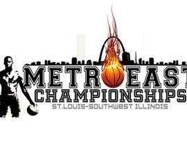
Great concept. Color in #30 and simplicity of colors in #28 stand out. For #30 would like to remove two players and replace with image of man in #28 . Also, change Illinois to Southwest Illinois. In #28 , remove Saint Louis and replace with the St. Louis-Southwest Illinois at bottom like #30 using the same color splash as in #30
- 11 år siden
-
Konkurrenceafholder - 11 år siden
No need to use the word St. Louis and Metro East. If using St. Louis, change to "St. Louis - Illinois"
- 11 år siden
-
mohamedriswan91
- 11 år siden
- 11 år siden
-
bharacuda
- 11 år siden
Fonts and colors are easily change if you wish. :D
- 11 år siden
-
bharacuda
- 11 år siden
Entry #9 and #10 same as #7 and #8 but different font style. :D
- 11 år siden
-
bharacuda
- 11 år siden
- 11 år siden
-
bharacuda
- 11 år siden
Entry #1 :D
- 11 år siden
-
Konkurrenceafholder - 11 år siden
Not enough contrast in colors makes the image hard to see
- 11 år siden
-
bharacuda
- 11 år siden
Entry #4 :D
- 11 år siden
-
Konkurrenceafholder - 11 år siden
I like this better than #4 . Font design is nice. Artwork is a lttle simplistic
- 11 år siden
-
bharacuda
- 11 år siden
Entry #5 . :D
- 11 år siden
-
Konkurrenceafholder - 11 år siden
Pretty good . . I don't like the green figure
- 11 år siden
-
mohamedriswan91
- 11 år siden
Can I get feedback on #6
- 11 år siden
-
Konkurrenceafholder - 11 år siden
Outstanding rendering. I really like. Would like to see a couple of different options in color with shadow man, like blue or red
- 11 år siden
-
Konkurrenceafholder - 11 år siden
Use words MetroEast in logo. For those familiar with the St. Louis, the metro area may be represented in logo by a familiar local landmark such as arch, riverboat, etc. This is not a mandatory requirement. Use your own judgement.
- 11 år siden
Sådan kommer du i gang med konkurrencer
-

Opret din konkurrence Hurtigt og nemt
-

Få tonsvis af indlæg Fra hele verden
-

Tildel det bedste indlæg Download filerne - Nemt!