Design a Logo for HERO
- Status: Closed
- Præmier: $50
- Modtagne indlæg: 109
- Vinder: gabrielasaenz

Konkurrence Instruktioner
My company name is Hispanic Employee Recruiting Online (HERO for short), LLC. We prefer to have HERO as the main part of the logo with Hispanic Employee Recruiting Online in smaller letters.
The LLC part is optional.
We are a recruiting company and work with many Fortune 500 companies, so our logo needs to be clean, sharp, sophisticated and modern.
I have attached a couple logo styles I have seen that we like.
We are open to any colors and ideas.
We will have a lot of future needs immediately such as business cards, letterhead, website design, icons, infographics, brochures, etc.
So please consider this a try-out for a lot more work for the top submissions.
Anbefalede færdigheder
Arbejdsgiverfeedback
“Gabriela did a fantastic job. She responded immediately and made every change that we requested. She could not have been any better. We hope to be able to work with her more in the future. Hire her!! You will NOT regret it. ”
![]() gmunoz66607, United States.
gmunoz66607, United States.
Offentlig Præciserings Opslagstavle
-

aboRoma
- 10 år siden
- 10 år siden
-

snowvolcano2012
- 10 år siden
any feedback for #84 ?
- 10 år siden
-

niccroadniccroad
- 10 år siden
Hi, #86 ?
- 10 år siden
-
snowvolcano2012
- 10 år siden
feedback #83
- 10 år siden
-
snowvolcano2012
- 10 år siden
please check out #80 .
i hope you like it.- 10 år siden
-
snowvolcano2012
- 10 år siden
I guess you wanted to have a logo like #71 . let me know if you like it or if you need any changes.
thanks and regards.- 10 år siden
-

Konkurrenceafholder - 10 år siden
looks good
- 10 år siden
-
snowvolcano2012
- 10 år siden
thanks :)
- 10 år siden
-
snowvolcano2012
- 10 år siden
please check out #74
thanks. :)- 10 år siden
-
niccroadniccroad
- 10 år siden
Hi, #73 ?
- 10 år siden
-

taniyamiths
- 10 år siden
Feedback on #72 plz.
- 10 år siden
-

sedayu
- 10 år siden
please check #59 too...thank's
- 10 år siden
-
Konkurrenceafholder - 10 år siden
i'm not liking this version
- 10 år siden
-
Konkurrenceafholder - 10 år siden
It has been brought to our attention that the logo you submited was copied.
- 10 år siden
-

jafrif
- 10 år siden
http://www.biz-logo.com/logo.php?logoid=997 #14 is exactly copy of this, I don't the ownership of that logo but on this website it is showed as sold
- 10 år siden
-
Konkurrenceafholder - 10 år siden
Thank you for making us aware of this, we really appreciate that.
- 10 år siden
-
Konkurrenceafholder - 10 år siden
just thinking out loud, there are 24 Latin countries.
- 10 år siden
-

adibow
- 10 år siden
feedback on #56
- 10 år siden
-
snowvolcano2012
- 10 år siden
please check out: #46 #52 #53
thanks.- 10 år siden
-

phamvanduit
- 10 år siden
Please feedback on #44 #47 #48
- 10 år siden
-
sedayu
- 10 år siden
please check #49 with any color
- 10 år siden
-
snowvolcano2012
- 10 år siden
feedback on #16
- 10 år siden
Vis 1 besked mere
-
snowvolcano2012
- 10 år siden
alright sir im working on it. thanks for your feed back.
- 10 år siden
-
snowvolcano2012
- 10 år siden
i actually tried to represent "online" through small "e" with a kind of arc around it like in the logo of internet explorer.
- 10 år siden
-

lukenewnham
- 10 år siden
could i get a bit of Feedback on #12 please.
- 10 år siden
-
lukenewnham
- 10 år siden
Thanks, i will try with a bolder font perhaps...
- 10 år siden
-
lukenewnham
- 10 år siden
Hello again,
Have posted an updated version #45 , and feedback or suggestions for alterations would be much appreciated.- 10 år siden
-
Konkurrenceafholder - 10 år siden
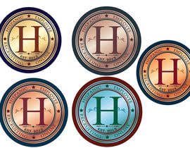
We added two files. 1 called Seal and another called Crest. Because there are some much words in our name, perhaps a "seal" logo would be best. Perhaps the H in the middle and Hispanic Employee Recruiting Online spelled out on the outside in a circle. You can put Est. 2012 or Founded 2012
- 10 år siden
-

izzrayyannafiz
- 10 år siden
feedback on # 7
- 10 år siden
-
Konkurrenceafholder - 10 år siden
We like how you stacked the words, Hispanic Employee Recruiting Online on top of each other. How about you get rid of the word hero. And use a different, large "H". That one does not look too professional. If you make one large H and put the words on the side of it you may have something.
- 10 år siden
-

jmcaguioa
- 10 år siden
feedback on #9
- 10 år siden
-
Konkurrenceafholder - 10 år siden
we like yours the best so far, however the font seems too plain. What other font ideas do you have. Also we would like to see a different color, maybe navy blue or a green. Also, do you have a different design for the side? Keep up the good work you are on the right path.
- 10 år siden
-

imamboll
- 10 år siden
please feedback at #39 and #40
thank you- 10 år siden
-
Konkurrenceafholder - 10 år siden
Hi and thanks for participating. #40 the O looks like a Q. We do not like the font either. #39 , I like what you were trying to go for, but the shield looks cheap and it is not symmetrical. the colors are not very business looking either.
- 10 år siden
-
imamboll
- 10 år siden
ok. i will try to make another logo
thank you- 10 år siden
-
snowvolcano2012
- 10 år siden
please feedback on #8
thanks and regards.- 10 år siden
-
Konkurrenceafholder - 10 år siden
the design to too far away from the wording. we do not like the font either. We do like the colors though.
- 10 år siden
-
snowvolcano2012
- 10 år siden
please feedback on #10 and #13
- 10 år siden
-
Konkurrenceafholder - 10 år siden
the design to too far away from the wording. we do not like the font either. We do like the colors though.
- 10 år siden
-
jafrif
- 10 år siden
Please feedback on my designs Thanks
- 10 år siden
-
sedayu
- 10 år siden
feedback on #14
- 10 år siden
-
Konkurrenceafholder - 10 år siden
this one is pretty good, the font seems too basic. We need something a little more elegant. Also the design under the word HERO doesn't match, are you able to put a different type of design there
- 10 år siden
-

groenter565
- 10 år siden
Hi Please have a look at #4 and let me know what you think
- 10 år siden
-
Konkurrenceafholder - 10 år siden
we do not like the orange swoosh, it is too distracting. The font is decent, but not exciting.
- 10 år siden
-

mykil
- 10 år siden
hi please check my entry #21 , and pls let me know your comments about it. thanks
- 10 år siden
-
Konkurrenceafholder - 10 år siden
We do not like the font or the Letter O or the mouse. Also if you can make the background white. I think this is a style that may work
- 10 år siden
-
niccroadniccroad
- 10 år siden
Hi, please check #24 . I also sent you a private message with some more info about the logo.
- 10 år siden
-
Konkurrenceafholder - 10 år siden
We do not like it. However, maybe if you can change the large H it will help a lot. Make it one solid color that fades.On the bottom of the large H, maybe you can use a shadow of a group of people to make the bottom half of the H. Also make the logo look shiny.
- 10 år siden
-

dinaroid
- 10 år siden
Please check #22 . Thank You
- 10 år siden
-
Konkurrenceafholder - 10 år siden
We like it, but how about a different font. Also the colors are too light. How about darker colors like navy blue, dark royal blue with silver or white. Also, maybe adding a light shadow to the font might bring it out some. Are you able to make it look like it is shiny/relective kind of like #21 .
- 10 år siden
Sådan kommer du i gang med konkurrencer
-

Opret din konkurrence Hurtigt og nemt
-

Få tonsvis af indlæg Fra hele verden
-

Tildel det bedste indlæg Download filerne - Nemt!