Design a Logo for a future website
- Status: Closed
- Præmier: $100
- Modtagne indlæg: 122
- Vinder: uniqmanage

Konkurrence Instruktioner
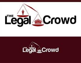
I'm looking for a stand-out logo design for a future website called 'The Legal Crowd'. The site will be a platform where lawyers around Australia will be able to provide legal services in a freelancer style setting. There are no restrictions on design, concept or colours - at the end of the day the logo should look sharp and professional so that it can be used in various media (ie online and in print).
I don't have any preconceived idea on how the winning logo will look, so be as creative as you can be. I suspect however that there will be some focus/reference on the 'crowd' part of the name in the logo - but don't feel limited to this as a creative design might throw that idea out the window.
Will require all the usual image formats from the winner to enable changes if required.
EDIT: After the first day of entries I can safely say I'm not looking for a logo using simple clipart using such things as scales, gavels, pillars etc which wouldn't have been hard for me to come up with myself . I'm looking for a MODERN designed logo. Thanks
Anbefalede færdigheder
Arbejdsgiverfeedback
“Great freelancer, understood concepts and ideas well. Was always happy to provide revisions to perfect design. Great working with this freelancer and will definitely use in future projects. Wish all freelancers on here were as good as uniqmanage! ”
![]() oddshoeau, Australia.
oddshoeau, Australia.
Offentlig Præciserings Opslagstavle
-

uniqmanage
- 10 år siden
Sir,
Please check my privste message kindly sir.
Thank you- 10 år siden
-
uniqmanage
- 10 år siden
Sir,
please check my private message
thank you- 10 år siden
-

mzovko
- 10 år siden
please check #159 thanks
- 10 år siden
-

davimarz
- 10 år siden
hi, please check full screen #166 , thanks
- 10 år siden
-
davimarz
- 10 år siden
the logo in the # 166 is characterized by a balance of the name
- 10 år siden
-

habitualcreative
- 10 år siden
sir please check #160
the best fresh new idea- 10 år siden
-

sheky21
- 10 år siden
#155 Feedback appreciated..... as per requirement.... modern logo .thanks
- 10 år siden
-
sheky21
- 10 år siden
#156 ?
- 10 år siden
-
uniqmanage
- 10 år siden
Sir,
please check #148, #149 , #150 and #151... Leave me a PM regarding what you think and changes via Private message
thank you :)- 10 år siden
-

hellokittyhanna
- 10 år siden
Thank you for your feedback. Would you be so kind to check the private message I have just sent you and respond to it. Thanks.
- 10 år siden
-

jinupeter
- 10 år siden
- 10 år siden
-
jinupeter
- 10 år siden
- 10 år siden
-
uniqmanage
- 10 år siden
Sir,
please check #142 too, and my PM
Thank you ")- 10 år siden
-
uniqmanage
- 10 år siden
Sir,
Thank you for inviting me sir.Please check my PMB
thank you- 10 år siden
Vis 6 beskeder mere
-

rogerweikers
- 10 år siden
Dear CH, good luck on your contest, business and life. Seeya
- 10 år siden
-

Konkurrenceafholder - 10 år siden
Thanks, and in future don't forget to check for feedback on message board when you request it on message board ;)
- 10 år siden
-
hellokittyhanna
- 10 år siden
Hi,
Please rate 138, can be improved to your recommendations. Thank you.- 10 år siden
-
Konkurrenceafholder - 10 år siden
Thanks for the entry. I was looking for something a little more creative.
- 10 år siden
-

fadzkhan
- 10 år siden
Hello CH... can you be more specific about your requirements .. Because i have been noticing that you still not got your Desire logo .. Please hit me message privately So i can help you right upto your requirements. Iam a professional Designer helping and wining contest since long time. REGARDS
- 10 år siden
-
Konkurrenceafholder - 10 år siden
See PM, thanks.
- 10 år siden
-
sheky21
- 10 år siden
feedback #129 please
- 10 år siden
-
Konkurrenceafholder - 10 år siden
Thanks for the entry. I don't like how you replaced the "o" with the scale as I think it detracts from the impact of the name. I did however like how the people were close together as it makes it look more like a crowd. Feel free to submit any further entries.
- 10 år siden
-
jinupeter
- 10 år siden
- 10 år siden
-

Cosminul
- 10 år siden
Hi,
Can you please give me a feedback on #128 entry, in order to improve it? Thank you very much !
Best regards,
Cosminul- 10 år siden
-
Konkurrenceafholder - 10 år siden
Hi, I actually quite like it - I'm in the process of thinking how it could be improved. At the moment "The" needs to be moved to the left inline with the start of "Legal". My other concern is that I'm unsure if 3 represents a crowd. I understand that the people also act as the pillars - so unsure how it will work if you had more or if you added arms...
- 10 år siden
-
Cosminul
- 10 år siden
Thank you for your feedback ! I will come back with a review according to your feedback.
Best regards,
Cosminul- 10 år siden
-
sheky21
- 10 år siden
#129 please have a look and provide a feedback
- 10 år siden
-

shubhangdabral
- 10 år siden
#76 please
atleast a rate- 10 år siden
-

usmanarshadali
- 10 år siden
#101 give me feedback
- 10 år siden
-

jstraumens
- 10 år siden
Hi!
Mine are #130 #131 and #132 (my favorite so far).- 10 år siden
-
Konkurrenceafholder - 10 år siden
Thanks for the entries - I'm not really liking them. I'm leaning towards entries that have a crowd theme/element to it.
- 10 år siden
-
jstraumens
- 10 år siden
OK
- 10 år siden
-

quangarena
- 10 år siden
:))
- 10 år siden
-
quangarena
- 10 år siden
- 10 år siden
-
quangarena
- 10 år siden
- 10 år siden
-
Konkurrenceafholder - 10 år siden
I've provided comments on PMB. Thanks
- 10 år siden
-

trentfleming
- 10 år siden
- 10 år siden
-
Konkurrenceafholder - 10 år siden
I've provided comments to each. 86 or 44 has a better concept - 89, 88, or 87 don't work well. Thanks
- 10 år siden
-
quangarena
- 10 år siden
hi, please check my new entry #95 .
- 10 år siden
-
trentfleming
- 10 år siden
Opinion on mine? are they in the running? Thanks!
- 10 år siden
-
minimaynie
- 10 år siden
Hi! again, please check and feedback on #94 , thanks!
- 10 år siden
-
Konkurrenceafholder - 10 år siden
Please check your private messages. Thanks
- 10 år siden
-
minimaynie
- 10 år siden
feedback on #85 please. thanks!
- 10 år siden
-
Konkurrenceafholder - 10 år siden
Thanks for the effort. I've look at all your entries and they aren't up to the standard I was looking for. I've rated for the effort you have put in, but they aren't being considered.
- 10 år siden
-
jinupeter
- 10 år siden
Check out #90 opinion?
- 10 år siden
-
Konkurrenceafholder - 10 år siden
Thanks for the entry but I'm not really liking the look of it with the outstretched arms etc. Looks like it is related more to a church than law. I've rated for effort.
- 10 år siden
-

helvete
- 10 år siden
opinion for #78 , please?
- 10 år siden
-
Konkurrenceafholder - 10 år siden
Not looking for that sort of style. Thanks
- 10 år siden
Sådan kommer du i gang med konkurrencer
-

Opret din konkurrence Hurtigt og nemt
-

Få tonsvis af indlæg Fra hele verden
-

Tildel det bedste indlæg Download filerne - Nemt!