Design a Company Logo

  • Status: Closed
  • Præmier: $190
  • Modtagne indlæg: 123
  • Vinder: Anamh

Konkurrence Instruktioner

We need a logo for a new company.
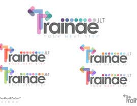
Company name: Trainae JLT

The company is an IT Consulting company based in UAE. The name has not any kind of special meaning. Nothing related to trains or training.
Could be interesting (but not mandatory) to highlight the "ae" part, since it stays also for Arab Emirates.
Consider that JLT is something like "LTD" and represents the Freezone where the company is located.

We like:
- minimal, modern and clean logos
- colorful but sober and simple logos

It would be interesting to have more versions of the same logo: one vertical, one horizontal, both in different colors.
It would be great to fit all the websites and services of the company (we develop mobile and web applications, enterprise platforms, ecommerce systems).

Anbefalede færdigheder

Arbejdsgiverfeedback

“@Anamh won the contest on 26 August 2013”

Profilbillede bornait, Italy.

Offentlig Præciserings Opslagstavle

  • eduardocauli
    eduardocauli
    • 10 år siden

    Hi, take a look at #132

    • 10 år siden
  • arteq04
    arteq04
    • 10 år siden

    #131 #130

    • 10 år siden
  • VEEGRAPHICS
    VEEGRAPHICS
    • 10 år siden

    Hello sir,
    Please check my designs #117 , #118 , #119 , #121 , #122 , #123 , #124 , #125 , #126 and give me your valuable feedback. I can give the B/W versions of the logo which you like.

    • 10 år siden
  • aquariusstar
    aquariusstar
    • 10 år siden

    hi please check #105 , #106 :-)

    • 10 år siden
  • wilfridosuero
    wilfridosuero
    • 10 år siden

    you can get all my entries

    • 10 år siden
  • tommasomanzi
    tommasomanzi
    • 10 år siden

    #75 e #76 check!!

    • 10 år siden
  • emocore07
    emocore07
    • 10 år siden

    #66

    • 10 år siden
  • antoaneta2003
    antoaneta2003
    • 10 år siden

    My first 3 star's rated entry here #48 . Thank you!

    • 10 år siden
  • bornait
    Konkurrenceafholder
    • 10 år siden

    I also love these arrows, coloured, transparent:
    http://www.shutterstock.com/s/direction/search.html#id=143097352&src=s134T9O8zUh1PuZIJ8lJ_w-1-9
    the "T" of Trainae could be like a "crossroad arrows" in this style.

    • 10 år siden
  • pinkulu2k
    pinkulu2k
    • 10 år siden

    Can you please elaborate what kind of design u want. U have said not to give importance to JLT but have given 3 stars to the design where JLT is very much highlighted.

    • 10 år siden
    1. bornait
      Konkurrenceafholder
      • 10 år siden

      Hello, I gave three stars to that design since it was more clean and original. It look more "professional" in my opinion. However it is too near to "atari"..
      About the design we are looking for: we want something really clean and modern, using a geometric font and armonic colors.
      Some example:
      http://abduzeedo.com/creating-crazy-cool-logo
      https://creativemarket.com/blog/2013/07/15/2013-logo-design-trends

      I don't mean to copy from that examples, just to get inspiration about the typology.
      Thanks,
      Luca

      • 10 år siden
    2. bornait
      Konkurrenceafholder
      • 10 år siden

      Also here you can find some ideas about fonts and colors:
      http://www.smashingmagazine.com/2007/03/13/inspire-yourself-58-creative-logos/

      • 10 år siden
  • emocore07
    emocore07
    • 10 år siden

    #41 sir :)

    • 10 år siden
  • Dindajaja06
    Dindajaja06
    • 10 år siden

    Please feedback #30

    Thanks

    • 10 år siden
  • bobbyfariz
    bobbyfariz
    • 10 år siden

    Please feedback #25 & #26
    Thanks

    • 10 år siden
  • bornait
    Konkurrenceafholder
    • 10 år siden

    Please try giving less importance to "jlt"

    • 10 år siden
  • bornait
    Konkurrenceafholder
    • 10 år siden

    No need to refer to Emirates in colors or design, we are an international company.

    • 10 år siden
  • bornait
    Konkurrenceafholder
    • 10 år siden

    Claim of the company will be: "Your next step". Maybe adding in the logo could give something more.

    • 10 år siden

Vis flere kommentarer

Sådan kommer du i gang med konkurrencer

  • Opret din konkurrence

    Opret din konkurrence Hurtigt og nemt

  • Få tonsvis af indlæg

    Få tonsvis af indlæg Fra hele verden

  • Tildel det bedste indlæg

    Tildel det bedste indlæg Download filerne - Nemt!

Opret en Konkurrence Nu eller slut dig til os i dag!