Quick Logo Revision Needed

  • Status: Closed
  • Præmier: $50
  • Modtagne indlæg: 72
  • Vinder: dongulley

Konkurrence Instruktioner

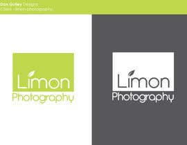
I used freelancer last year to get my logo, so I'm reaching out here again. This time, I just need a bit of shape up to it to make it easier for me to use in various things. My logo is simply my company name for the most part, and a cross section of a lime for branding. While I do like my logo, I need something a bit shorter and more modern, pretty much like a seal or stamp if you will. Here are some details to help clarify what I'm looking for:

1. Since my logo is the company name, it's quite long. This works most of the time, but I would like some variations of it so it's not as long. In other words, I'm looking for the words to be either stacked on top of each other uniformly, or circled around either the full lime wedge or half lime wedge. Just a few variations to see what looks good.
2. I would like to keep the font consistent. If the same font is not used, the lettering needs to look similar, since it's part of the logo.
3. I essentially want 2 variations, a square format and a round format. Again, think of it like a seal or a stamp. I want to be able to use it as my main logo on the website, but also be able to watermark photos if needed. Having an outline of a box and the logo inside is ok as well.
4. I would like it in white (outlined in thin black to make it standout)
5. I really want it to feel modern.
6. I need the adobe illustrator file on delivery

So basically, it's just a revision of the current logo in a square/circle format, to make it like a seal/stamp. I'm adding my current logo for reference. For someone who does this sort of thing for a living, it's quick $50. Don't be afraid to get creative, even if it means going outside of what I suggested. The more creative and clean (while still maintaining the concept), the more likely it will get chosen.

*** Notes 11/5: Thank you to all who have posted so far. There are a lot of submissions, however, it's still not along the lines of what I am looking for. I just want to make a few points that might help you understand better what I want.
1. A lot of you are including the lime logo, which is fine. However, you don't have to use it within the words itself. The lime and the lettering should be separate. Also, the whole lime does not have to be used. Feel free to use half of it if it's easier.
2. If the lime logo feels forced, then don't use it. If the words and lettering looks good as a standalone, then use that, and maybe have a variation with the lime as well. It's more about the aesthetics and having it look really polished than forcing to use everything.
3. Some of you are still putting the whole "limon photography" in one line. Again, that's too long, and I need it somewhat stacked since I'm trying to have a block or a seal type logo.
4. Feel free to actually use a square outlined box around the words and logo to have it within a box
5. Please avoid cheesy cliches such as having outlines of a camera around the words. It has the word photography, it will be used on a photo website, logo doesn't have to have a camera in it.
6. As I said, if you feel there's a different font which is somewhat similar but fits, feel free to use another font. It needs to look modern and clean.

For some ideas you can check out my friend Ryan Flynn photography's website, Juya Photographer, Chrisman's studios, as well as rawfolio.com's "Mason" theme logo

Anbefalede færdigheder

Arbejdsgiverfeedback

“I already had a logo, but wanted a revamped version for a new website and watermark. Regardless of posting details of what I wanted, most designers were giving me generic or un-original logos. Dongulley was the first person to actually read the description properly and give me just what I was looking for. He even did a few revisions on his own, as well as one that I suggested. He was professional, courteous, speedy, and most importantly, wanted to really work with me to get me what I was looking for. Really happy with his work, and will definitely hire again in the future. ”

Profilbillede mistamoni, United States.

Offentlig Præciserings Opslagstavle

  • mistamoni
    Konkurrenceafholder
    • 10 Ã¥r siden

    Thank you all for your submissions. I want to give a special thank you to dongully and alexandracol. I think they understood what I wanted the best, and came the closest to what fit. It was very close, but I liked dongully's design slightly better, so he won the contest. Thank you all again for your hard work.

    • 10 Ã¥r siden
  • Pato24
    Pato24
    • 10 Ã¥r siden

    #153

    • 10 Ã¥r siden
    1. Pato24
      Pato24
      • 10 Ã¥r siden

      #154

      • 10 Ã¥r siden
  • galinagauri
    galinagauri
    • 10 Ã¥r siden

    If you would give your feed back on my work, i would make exactly what you have in your mind ( in case you have :)). Otherwise my working is not very efficient, it goes more like try and error, just to find out what you like, what not.... If you really want to get logo you like, it would help you to target your designers to more concrete tasks, working on every next detail. Otherwise you play here kind of lottery. Perhaps somebody will surprise you, or maybe not..... All the best :)

    • 10 Ã¥r siden
    1. mistamoni
      Konkurrenceafholder
      • 10 Ã¥r siden

      Thank you for your submissions. I did specify exactly what I need in the description, as well as add an edited note to describe more in detail of what I need along with sites with examples. I don't want to say exactly what I want because I want it to be somewhat open, because maybe what I have in mind is not the best outcome, and something a designer can design that I wasn't expecting be the right design.

      • 10 Ã¥r siden
  • zrbappy
    zrbappy
    • 10 Ã¥r siden

    Check #143

    • 10 Ã¥r siden
  • dongulley
    dongulley
    • 10 Ã¥r siden

    please consider #108 & #94 . I am more than willing to continue helping you with logo after contest!

    • 10 Ã¥r siden
  • galinagauri
    galinagauri
    • 10 Ã¥r siden

    What would you say about #137 ? Thanks for feed back.

    • 10 Ã¥r siden
  • zrbappy
    zrbappy
    • 10 Ã¥r siden

    Please check #136

    • 10 Ã¥r siden
  • papaweb10
    papaweb10
    • 10 Ã¥r siden

    Please check #130 #131 #132

    • 10 Ã¥r siden
  • airijusksevickas
    airijusksevickas
    • 10 Ã¥r siden

    Please check #129 Vector thanks.

    • 10 Ã¥r siden
  • alexandracol
    alexandracol
    • 10 Ã¥r siden

    Hi! Please check my new entry # 104 #105 #106 #107 Thank you

    • 10 Ã¥r siden
  • dongulley
    dongulley
    • 10 Ã¥r siden

    Please consider #94

    • 10 Ã¥r siden
    1. dongulley
      dongulley
      • 10 Ã¥r siden

      Sure thing....I'll get it to u today

      • 10 Ã¥r siden
    2. dongulley
      dongulley
      • 10 Ã¥r siden

      I uploaded it.. #108

      • 10 Ã¥r siden
  • vladspataroiu
    vladspataroiu
    • 10 Ã¥r siden

    Added an idea for your logo, #93, let me know if you like it. Thanks.

    • 10 Ã¥r siden
  • mNorbert
    mNorbert
    • 10 Ã¥r siden

    Hello,

    I’m a student, web designer and developer currently based in Szczecin, Poland (Europe). ​​I'm freelancer specializing in webdesign and branding. I'm interested in cooperation with you. I can offer designing website and slicing project to html and css.

    I’ve started doing professional works in webdesign in 2007. As the time has passed, experience allowed me to craft my skills. I’ve been constantly trying to improve every day. I’m technically proficient, easy to work with and I love my job. So what are you waiting for?

    Thanks for considering me for your project and I am excited being associated with you. My projects are featured on behance.net and webdesignserved.com

    PORTFOLIO:
    www.behance.net/norbert
    www.mierzwa.org​

    • 10 Ã¥r siden
  • dongulley
    dongulley
    • 10 Ã¥r siden

    Please Consider #69

    • 10 Ã¥r siden
  • mistamoni
    Konkurrenceafholder
    • 10 Ã¥r siden

    Thank you all for your submissions so far. I added some more notes to clarify what I'm looking for. Please see the updated section marked by ***.

    • 10 Ã¥r siden
    1. dongulley
      dongulley
      • 10 Ã¥r siden

      thanks for the rating...any feedback would help.

      • 10 Ã¥r siden
    2. dongulley
      dongulley
      • 10 Ã¥r siden

      Please consider #69 as well.

      • 10 Ã¥r siden
  • daisylucy
    daisylucy
    • 10 Ã¥r siden

    Hi, IF you like any of my designs and would like to change the color to see the different, please let me know! Thank you :)

    • 10 Ã¥r siden
  • urbanblue
    urbanblue
    • 10 Ã¥r siden

    please check #52 :)

    • 10 Ã¥r siden
  • tanasalexandru
    tanasalexandru
    • 10 Ã¥r siden

    Please feedback #49 Thank you

    • 10 Ã¥r siden
  • maxtvprogram
    maxtvprogram
    • 10 Ã¥r siden

    Let me know what you think about #35 sir. Thank you

    • 10 Ã¥r siden
  • maxtvprogram
    maxtvprogram
    • 10 Ã¥r siden

    Please feedback for #35

    • 10 Ã¥r siden
  • zubairblaze
    zubairblaze
    • 10 Ã¥r siden

    #37

    • 10 Ã¥r siden
  • zubairblaze
    zubairblaze
    • 10 Ã¥r siden

    Please feedback for #36

    • 10 Ã¥r siden
  • tanasalexandru
    tanasalexandru
    • 10 Ã¥r siden

    Please feedback # 22 #27 Thank you

    • 10 Ã¥r siden
    1. tanasalexandru
      tanasalexandru
      • 10 Ã¥r siden

      #22

      • 10 Ã¥r siden
    2. tanasalexandru
      tanasalexandru
      • 10 Ã¥r siden

      #28

      • 10 Ã¥r siden
  • manuel0827
    manuel0827
    • 10 Ã¥r siden

    #26 Clean Modern logo, Thanks!

    • 10 Ã¥r siden
  • manuel0827
    manuel0827
    • 10 Ã¥r siden

    #25 Thanks

    • 10 Ã¥r siden
  • tanasalexandru
    tanasalexandru
    • 10 Ã¥r siden

    Please feedback my logos #10 #11 #12 #13 #16 #20 all logos its difert style with 2 fonts and diferent effects.Thank you

    • 10 Ã¥r siden
    1. tanasalexandru
      tanasalexandru
      • 10 Ã¥r siden

      #21

      • 10 Ã¥r siden
  • hasanreza
    hasanreza
    • 10 Ã¥r siden

    Please check it and let me know the result of quality.
    After finalizing I will send the single one.

    • 10 Ã¥r siden
  • Backhash
    Backhash
    • 10 Ã¥r siden

    Let me know what you think about #1 sir. Thank you

    • 10 Ã¥r siden
    1. mistamoni
      Konkurrenceafholder
      • 10 Ã¥r siden

      I'm sorry, but that's does not look professional to me. I could have done both of those myself in photoshop. I'm looking for something a lot more polished.

      • 10 Ã¥r siden
    2. Backhash
      Backhash
      • 10 Ã¥r siden

      Good Luck

      • 10 Ã¥r siden
  • mistamoni
    Konkurrenceafholder
    • 10 Ã¥r siden

    I believe the font is called Metro

    • 10 Ã¥r siden
    1. Backhash
      Backhash
      • 10 Ã¥r siden

      thank you

      • 10 Ã¥r siden
  • Backhash
    Backhash
    • 10 Ã¥r siden

    Hello sir, could you specify the font used?

    • 10 Ã¥r siden

Vis flere kommentarer

SÃ¥dan kommer du i gang med konkurrencer

  • Opret din konkurrence

    Opret din konkurrence Hurtigt og nemt

  • FÃ¥ tonsvis af indlæg

    Få tonsvis af indlæg Fra hele verden

  • Tildel det bedste indlæg

    Tildel det bedste indlæg Download filerne - Nemt!

Opret en Konkurrence Nu eller slut dig til os i dag!