Design some Business Cards for free coaching services
- Status: Closed
- Præmier: $50
- Modtagne indlæg: 49
- Vinder: ImPixelboy
Offentlig Præciserings Opslagstavle
-

quaarc
- 11 år siden
I have some new designs but it seems that i cant post them anymore.
- 11 år siden
-

ImPixelboy
- 11 år siden
Hi ! I've submitted two new designs, #54 and #55 ,
Hoping your comments soon!- 11 år siden
-
Konkurrenceafholder - 11 år siden
Please post all future submissions on a white background with the correct dimensions and symmetrical orientation so that I can look at them side by side printed and make an accurate decision. thanks!
- 11 år siden
-
Konkurrenceafholder - 11 år siden
The top designs are so good, it's hard to pick!! Here are some preferences that are emerging for me as I try to choose:
1) I really like the rounded headshot with an asymetrical border like you see in 30, 34, 42 and 45-48
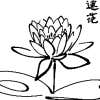
2) Less is more for the lotus image (I like the one in 27, 40 and 41 the best I think)
3) I like the two-tone on Side 2 with contact info in "magenta" on the bottom
4) I like the font best on green parts of 41 and the contact info on 34
5) I like the email and phone icons you you see on 41
6) while 34 matches my flier perfectly, it seems more feminine, and I'd like something that appeals to men and women
I aim to make my choice sometime today or tomorrow.
thanks for all of the submissions!- 11 år siden
-

gabix89
- 11 år siden
Hi!
Please check #42 (2 image), #43 , #44 (2 image), #45 (2 image)!
Thanks!- 11 år siden
-
ImPixelboy
- 11 år siden
Hi ! thanks for rating my first shots :)
Please can you also give some feedback on #24 and #25 ? , and feel free to check more of my work here http://www.coroflot.com/pixelboy
Hoping hearing from you soon!
Regards,
Nik
Creative Director at PixelBoy!- 11 år siden
-
Konkurrenceafholder - 11 år siden
I love the way that the text is laid out on Side 2 of #18 w/ the icons for email/phone... i also like the lotus on Side 1 of #18 but not the mis-matched image on Side 2 ~ the best colors are in #9
- 11 år siden
Vis 1 besked mere
-
quaarc
- 11 år siden
Hello sir,
Let me know your feedback on #19 , this is a plain background and little changes on the design. Please let me know your valuable feedback. Thanks.- 11 år siden
-
Konkurrenceafholder - 11 år siden
I definitely like seeing the images with the curved corners as I requested ~ and gave #4 3 stars because it has all of the information I requested on the correct side.
In terms of a lotus-like image, I like something like what you see at http://www.blossominglotusacupuncture.com/resources/lotus.jpg that is silhouetted so that it is more like the butterflies in #13 or like the one on my flier.- 11 år siden
-

kathieturner
- 11 år siden
Ok, I made the lotus from scratch on #16. Don't know if you like it or not. If you prefer the example image you've provided over my pink version then I'll try to create it later as well. Will look for your feedback later tonight (U.S. time), or tomorrow. Thanks for all the positive feedback. If it weren't for your help we wouldn't be able to achieve our goal.
- 11 år siden
-

ndgoswami
- 11 år siden
I have submitted my entry @ #13 but for some technical reason it is not showing in the original colors...Don't know why? By the way if possible I can send you those original images to your email? Thanks
- 11 år siden
-
ndgoswami
- 11 år siden
I'm trying to submit entry with .PSD format. Let see it works or not!
- 11 år siden
-
kathieturner
- 11 år siden
I noticed when I did all caps, it didn't give me the "script" look, like example #7 (that's why I did #7 like I did).
Also, I didn't have a pic of a lotus, so I made one from scratch. Hope it's up to your standards.- 11 år siden
-
kathieturner
- 11 år siden
I forgot to add... look at the difference between the backgrounds on #1 and #2 , do you like either of those?
- 11 år siden
-
kathieturner
- 11 år siden
Please view and rate #1 & #2 . On both submissions, I've attached the backside of the card in the lower right. Although you can't see all the wording d/t the pic's shrinkage, it's there.
Thank you,
Kathie- 11 år siden
-
Konkurrenceafholder - 11 år siden
Thank you for your submission! I like the all caps for DISCOVER etc. but am not sure about that font -- id prefer no sarif (?) more elegant/feminine and on a rounded shape card (see attached template) -- I dont see the contact info, are you saying you would add that?
- 11 år siden
-
kathieturner
- 11 år siden
Ok, I'll change the font and see what you like best. The contact info is on there, but because I "squished" the backside example onto the front, it got squished out of the pic. I'll give you an example of the backside by itself. I can't thank you enough for the wonderful way you express what you're looking for. It truly helps. :)
- 11 år siden
-
Konkurrenceafholder - 11 år siden
As you can tell the lotus is an important symbol for me, so putting some kind of watermark-type lotus (2d or 3d) on the card like the labrynth on the sample biz card could be cool
- 11 år siden
Sådan kommer du i gang med konkurrencer
-

Opret din konkurrence Hurtigt og nemt
-

Få tonsvis af indlæg Fra hele verden
-

Tildel det bedste indlæg Download filerne - Nemt!