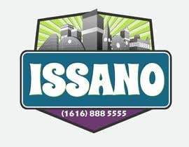
Logo/Branding Design for Fast Food Delivery Service
- Status: Closed
- Præmier: $490
- Modtagne indlæg: 91
- Vinder: tayvano

Konkurrence Instruktioner
Business is a very busy fast food restaurant. Mainly delivery service to customer's home address.
Selling pizzas, kebabs and burgers and delivering to families and young couples in northern England (Manchester).
Main principles of business are provi
Anbefalede færdigheder
Arbejdsgiverfeedback
“I would highly recommend working with tayvano she has a highly motivated and energetic personality thus allowing her to constantly present you with fantastic designs. We had many changes to our original design and mostly very detailed time consuming ones, but her attitude towards this was fantastic. Highly professional designer and fun to work with. Mainly and mostly I would emphasize that her quality of work is a very high standard, her thoughts don't lie on a basic level when you ask for her input on improvements.”
![]() kasra1976, United Kingdom.
kasra1976, United Kingdom.
Offentlig Præciserings Opslagstavle
-

Konkurrenceafholder - 11 år siden
Thanks to eveyone who took part. :)
- 11 år siden
-

AnaCZ
- 11 år siden
Congratulations tayvano!
You were on the right track from the very beginning :-)- 11 år siden
-

andreeaprisaca
- 11 år siden
Please check #150 , #151 and rate it. Thank you.
- 11 år siden
-

crhino
- 11 år siden
It never ceases to amaze me, tayvano gets 4 stars and suddenly several people now also have a cityscape in their logos??? Use your own ideas, stop stealing from other people! Especially vidyag1985, yours is so similar to tayvano's and it even gets rewarded with 3 stars???
- 11 år siden
Vis 2 beskeder mere
-

tayvano
- 11 år siden
The funniest thing was the "fresh food fast" that I had originally is in almost everyone's design now. I was just using it as a space holder!
- 11 år siden
-
crhino
- 11 år siden
Indeed tayvano, I had noticed that too. So many people on here either copy the logo with most stars or simply copy and paste from somewhere else on the net. It must be so hard for CH's, we as artists, do spend most of our time looking at reference material, so are more likely to spot a cheat.
- 11 år siden
-

Kuczakowsky
- 11 år siden
one more please #162
- 11 år siden
-
Kuczakowsky
- 11 år siden
and #159 , thanks
- 11 år siden
-
Kuczakowsky
- 11 år siden
Hi There, please check #157 and #158
- 11 år siden
-

gate2stars
- 11 år siden
Check #143 .thanks
- 11 år siden
-

sawantamey
- 11 år siden
please rate #152. Thanks!
- 11 år siden
-
andreeaprisaca
- 11 år siden
please rate #150 , #151 . Thanks!
- 11 år siden
-
crhino
- 11 år siden
Sorry, but these colours just don't work for fast food. Maybe it's just me, but bright red says fast and NOW to me, lol.
- 11 år siden
-

NabilahZainal
- 11 år siden
I know my submission is quite late. I'm glad if you can take a look at my logo design. #138 , #139 , and the sample with your products #133 , #134 , #135 , #136
Thank you very much- 11 år siden
-

Sidqioe
- 11 år siden
Check and give me some feedback please #129 , #130 , #131 .
Thanks .- 11 år siden
-

JDesignsCo
- 11 år siden
Hi, i have added a little sample comments welcome.... #125
- 11 år siden
-
crhino
- 11 år siden
Hi, #115 is two logos, designed to be used in conjunction with each other or separately. The others are just variants on the theme. The 'I' logo is intended for a sign or badge etc. Hopefully, you would become recognizable from this alone and customers would instantly spot you from a distance. If you like any of them, I could do some mock ups. Cheers.
- 11 år siden
-
sgsuk
- 11 år siden
Please Rate 90
- 11 år siden
-
andreeaprisaca
- 11 år siden
Hi! Can you please give me some feedback on entries #88 ,89. Thanks!
- 11 år siden
-
VoxelDesign
- 11 år siden
Entry #82 , feedback if any
- 11 år siden
-
AnaCZ
- 11 år siden
Letters in "Issano" can be spaced differently. Slogan can be centered and made bigger. Etc... #75
- 11 år siden
-
AnaCZ
- 11 år siden
in #74 I changed the font from the slogan into Futura and changed it to orange for a more sleek and contemporary look.
- 11 år siden
-
AnaCZ
- 11 år siden
*correction, Helvetica, not Futura.
- 11 år siden
-
AnaCZ
- 11 år siden
Hi kasra1976
Thank you for your feedback. I removed my previous submissions and want to start fresh with a completely different concept.
You suggested the logo should be contemporary and fun. I agree.
Nevertheless, the definition of what is "fun" have many facets. So here is one approach: maybe its fun to have the fonts be made out of packaging paper, since the food will be delivered in some sort of packaging. What do you think? See example in #70 #71 #72 #73.
We can add more color and play with it later. I just need to know what you think of the idea.
Thank you again,
Ana- 11 år siden
-
VoxelDesign
- 11 år siden
Entry #62 #63 #64 , feedback if any
- 11 år siden
-
VoxelDesign
- 11 år siden
Hi CH, please check Entry #62 #63 , feedback if any , best of luck
- 11 år siden
-
VoxelDesign
- 11 år siden
Guarantee it plz so I can join as well....;)
- 11 år siden
-

bggfeb
- 11 år siden
Hi sir, how was my logo. If any idea from your side.No.56, My suggestion is Use Black t-shirt with red apron. Red/yellow cap and black cotton shoe. Makes very approach.
- 11 år siden
-

robert69dc96
- 11 år siden
how abourt sir guaranteeing the project? so you can entice and pull up more entries. thank you
- 11 år siden
-

boldarts
- 11 år siden
Please if you can guarantee I would appreciate
- 11 år siden
-
AnaCZ
- 11 år siden
We could add 3 stripes of your preferred colors to the background : #33 ...And then maybe make those stripes rough around the edges: #34, #35, #36
- 11 år siden
-
Konkurrenceafholder - 11 år siden
Hi,
Thank you for your designs. Overall it is not what we had in mind. We really wanted something with a contemporary illustration, fun and with the bold coloring. We feel the stripes of color do not contribute to adding sales for a fast food place.
I hope this helps.
Any question you may have just keep posting I will check the website all day tomorrow.
Kind regards- 11 år siden
-

jameskradphej
- 11 år siden
Hi There,
Please give feedback on #50 - #53 . I've gone for a simple approach, not sure if the phone number format is right for the UK.- 11 år siden
-
Konkurrenceafholder - 11 år siden
Thank you for the time you have taken with this.
We did not like the font used and we can see the illustration of the pizza in the background but as pizzas do not get eaten in that way usually we keep thinking it looks like a fruit. Perhaps if the font changes and the illustration we can build detail on that.
Many thanks again- 11 år siden
-
AnaCZ
- 11 år siden
#32 - just quickly injecting a background color to #31
- 11 år siden
-
AnaCZ
- 11 år siden
#31 - another preliminary concept. The fruit (could be a lemon or lime..these are abstractions- not to be taken literally) is also a pizza. The slice of the pizza is also a wedge of the fruit.
These are just ideas. The final visual styling and effects need to be studied and improved.
For now, just curious if the IDEA resonates with you.
thanks,
Ana- 11 år siden
-
AnaCZ
- 11 år siden
Hi there,
#28 is just a preliminary concept. The idea is that the serving tray is also a fresh veggie/fruit.
Detailes can and should be further improved. A font types study is still necessary.
Just wanted to know if the initial idea resonates with you.
Simple and sleek will suit the modern interior.
thanks,
Ana- 11 år siden
-
AnaCZ
- 11 år siden
Dear Contest Holder,
a few questions before embarking into the design:
Does the word "Issano" means anything other than "lifted"?
We know its fast food (I saw the current logo - it really need help) ...but aesthetically, what is the style of the restaurant? Do you have pictures?
thank you
Ana- 11 år siden
-
Konkurrenceafholder - 11 år siden
Issano does not mean anything at all it was the name of the previous owners son. So forget about the the meaning "lifted" as the name is completely irrelevant.
The shop is a contemporary modern looking shop and the food on the menu is simple but very fresh. There is a lot of stainless steel walls and the counters are glossy white.
Hope this helps.- 11 år siden
-
AnaCZ
- 11 år siden
Thanks. That really helps :-)
- 11 år siden
-
robert69dc96
- 11 år siden
gud day CH, is it possible to sealed this contest? thank you
- 11 år siden
-
Konkurrenceafholder - 11 år siden
As we are spending a large amount for a logo design we are not currently in a position to add to the contest costs by making it sealed.
- 11 år siden
-
robert69dc96
- 11 år siden
how abourt sir guaranteeing the project? so you can entice and pull up more entries. thank you
- 11 år siden
-
boldarts
- 11 år siden
Name of the business please.
- 11 år siden
-
Konkurrenceafholder - 11 år siden
Please read the brief...ISSANO
- 11 år siden
-

ScotchDesign
- 11 år siden
Does the price include website design?
Seems like you would be getting a lot for your money.- 11 år siden
-
Konkurrenceafholder - 11 år siden
It is just a Logo design. Please re-read the brief, we have just detailed where the logo will be used so you can design accordingly. I think you will find it is a lot of money for a logo design.
- 11 år siden
-
sawantamey
- 11 år siden
check Please #6,#7,#9
- 11 år siden
-
Konkurrenceafholder - 11 år siden
I have sent you a message. Thanks
- 11 år siden
Sådan kommer du i gang med konkurrencer
-

Opret din konkurrence Hurtigt og nemt
-

Få tonsvis af indlæg Fra hele verden
-

Tildel det bedste indlæg Download filerne - Nemt!