Freelancer: MrVoon
Del:
Anmeld Indlæg

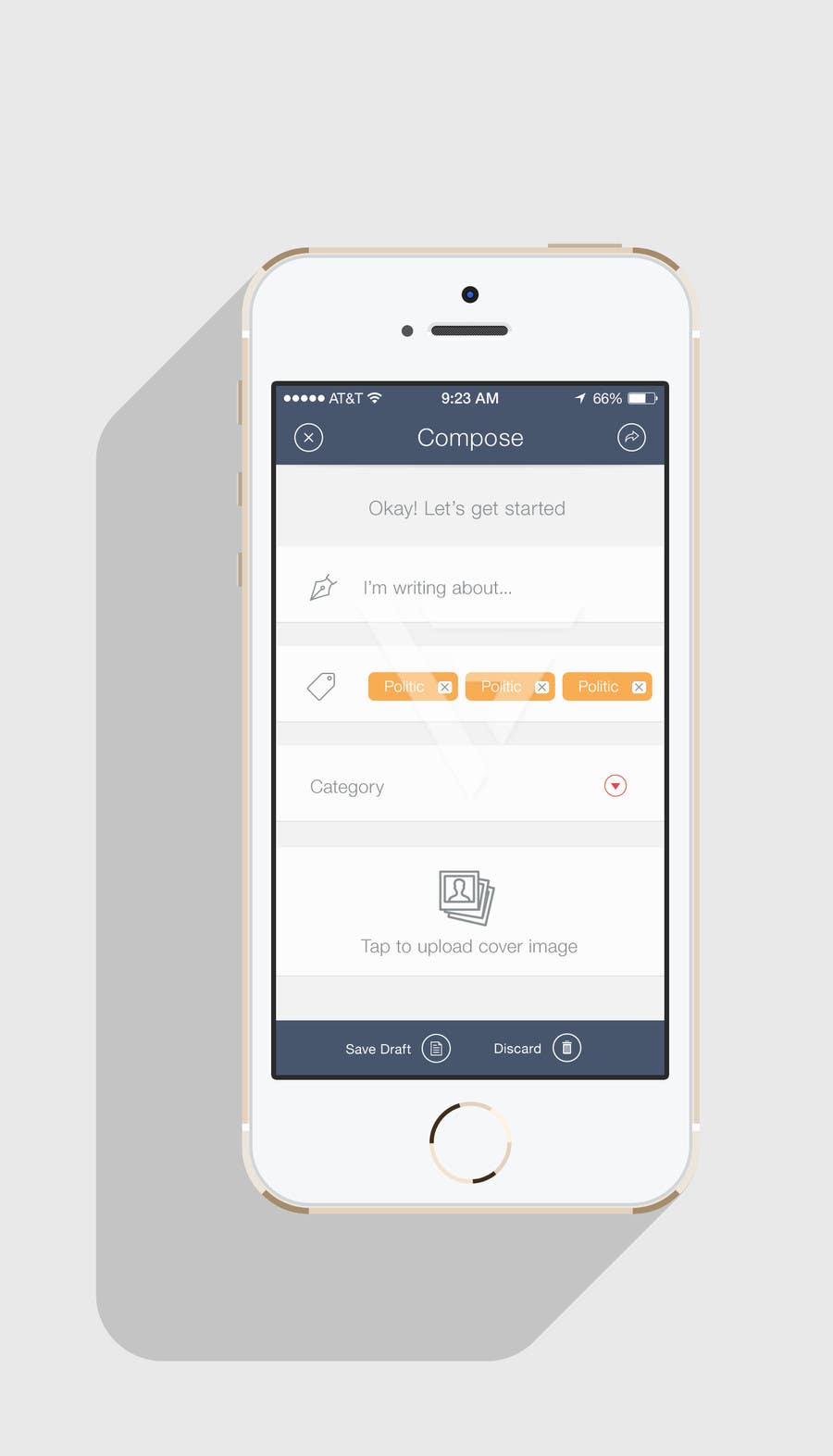
Compose Screen - Concept 2

Now make it more friendly where user will guide through the wizard. Screen 1 : Step 1 of composing a new post (Basic Info) Screen 2 : Step 2 of composing a new post (Date) Screen 3 : Step 3 of composing a new post (Article body) Screen 4 : Step 4 of composing a new post (additional media upload which will shown in the slider) Screen 5 : Indicating the success of publishing a new article.
Konkurrenceindlæg #11 for                                                 iPhone Application Design

Offentlig Præciserings Opslagstavle

  • fpanfilov
    Konkurrenceafholder
    • 10 år siden

    Looks awesome, but too complex. Previous single-page concept was good, you should try to change header appearance, colors, font (in text editor they can look more typographic).
    You can check out more information about keyboard appearance and accessory view on contest description page.

    • 10 år siden
    1. fpanfilov
      Konkurrenceafholder
      • 10 år siden

      There will be only 3 single-line fields and Text View, so I think, multiple-screen will be too complex. Furthermore, user is not able to upload any images, he can just pick already uploaded picture using button at accessory view.

      I really very like your design. Let's try different compose page and logo, other pages are already cool enough.

      • 10 år siden
    2. MrVoon
      MrVoon
      • 10 år siden

      Um hm, let double check, the compose screen will need to have the following fields

      1. Title
      2. Date and Time
      3. Post categories
      4. Switch to enable or disable comments
      5. Text view with post content (3 lines)

      Am i correct

      • 10 år siden