Freelancer: kenbonilla
Del:
Anmeld Indlæg

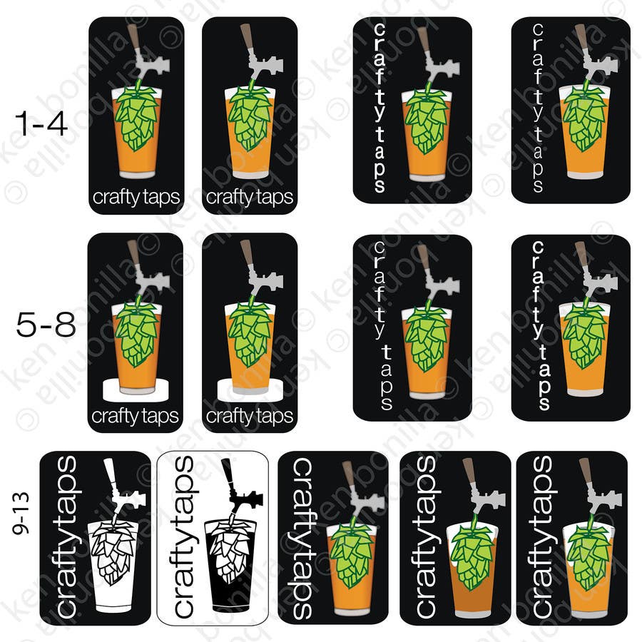
ct6-2 rev of entry #20

We have here a few different arrangements, including a couple of B&W proofs for demonstration purposes. I tried capping the glass a couple of different ways to emphasize the head. I feel that #12 and #13 are spot on for where this logo should be. Your feedback has been greatly appreciated, it's a nice change of pace to work with someone who provides such thorough input. I think with this next round of critiques, I will be able to submit a final proof of concept within the next 24 hours and lock in the final design. Turn around for the final design should be within 24 hours of approval of the final proof of concept.*** Ken Bonilla
Konkurrenceindlæg #49 for                                                 Design a Logo for Crafty Taps

Offentlig Præciserings Opslagstavle

  • TheVman
    Konkurrenceafholder
    • 10 år siden

    Thanks Ken,
    I really like your work, and quick responses, but we still have a little bit of work before we get there.

    So i've helped you out and taken your example and 'tweaked' it a bit, to what i'm after see - http://www.craftytaps.com/images/example.png

    Glass: you can see i've added the head, and a highlight.
    Tap: I've shortened the handle, and changed the colour slightly
    Fonts: You can see i've laid them out as though they form the stem of the tap.

    My example is way from perfect (hence me working with you) but I think you get the gist of what i'm after. If you could tidy up my effort, and add both a white and black bg, I think we'll be there ;)

    Thanks

    • 10 år siden